The assignment was to photograph an open gallery held in an artist's studio disguised as the backyard of a lovely, Hillsborough home. My assignment was to submit a photo as quickly as possible, since the exhibition would be closing in three weeks. And because community photos only run on Mondays, I didn't have much time between the Saturday shoot date and the Sunday deadline.
My host, Steve Lewis, is a bit of a Renaissance Man, an artist who photographed, painted, and sculpted. Being a photographer, I was a little nervous, as one usually is when working with another practitioner fully capable of making informed criticism of one's work. I had to remind myself, as I remind all of you, that the pursuit of every specialty area, including community photography, will require a specific skill set. It didn't take long to realized that using speedlights was a very foreign thing to many photographers, especially those who tend to photograph landscapes, architecture,and other subjects too large to illuminate artificially. But for better or for worse, working with artificial lights, particularly speed lights, has become second nature to me.
 |
| Photo #1 |
My first impulse was to photograph Steve in front of a display of his photographs, a logical thing to do for a fellow photographer. But when I asked to see his work, I found a display of his framed photographs under a translucent tent in his back yard. Even in this sketch photo (Photo #1) you can see the the entire world reflected in the protective glass. Short of making the photo at night, I was flummoxed. I gave some thought to returning later in the day when the sky was (hopefully) not quite so bright.
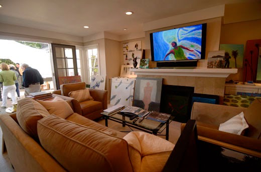
I spoke with Steve about this, and discovered that a small room by the garden held his paintings, some mounted, some on the floor, with others presented in a slide show on the LCD above the fireplace. When I asked if he wanted to be identified as a photographer, he said he thought of himself more as a painter. Light bulb. My focus shifted from the photos in the back yard to the paintings in this anteroom.
 |
| Photo #2 |
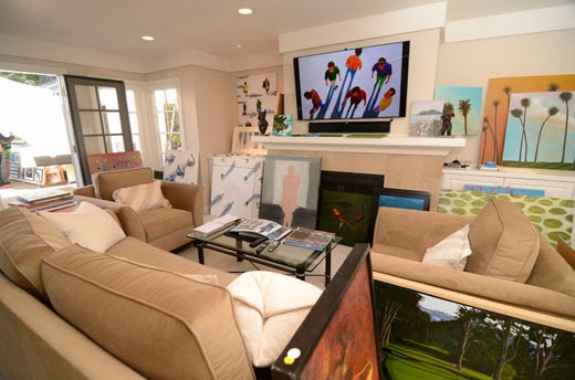
Using aperture priority, I made this first image (Photo #2) with an eye on keeping the LCD panel as an dominant graphic element. The exposure was 1/100, F 3.2, ISO 200 with a Tokina 2.8 11-17 lens set to 11mm.
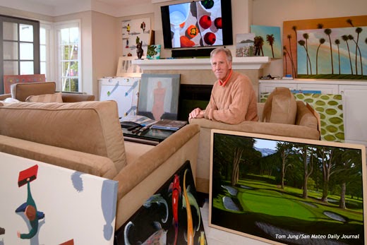
I shifted to Manual exposure and applied the shutter speed and aperture settings selected by the camera. By adding an on-camera flash bounced behind me and to the left, I got this image (Photo #3).
 |
| Photo #3 |
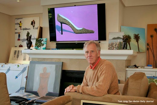
Just for fun, I decided to add an accent light from high, camera left. I used a Rogue Grid on a remote speedlight. I aligned it by sitting in seat and looking at it, adjusting it until the grid was aimed directly at me. This wouldn't provide a lot of light, just enough to give the face some shape. The submitted image is seen here (Photo #4).
 |
| Photo #4 |
I made several exposures, and submitted this one because of the red accents in the painting that was "playing" on the LCD in the background. And just to be safe, I switched to a second camera with a 24-70mm lens for a tighter composition. Both cameras had been set to the same ISO/shutter/aperture settings, so there was no need to do anything but swap out the commander speedlight and shoot (Photo #5).
 |
| Photo #5 |
The tighter composition lost most of the context provided by the paintings in the foreground, and made the shoe far more prominent than it needed to be. After I made a few shots, I decided that this tighter version wouldn't be submitted.
 |
| Photo #6 |
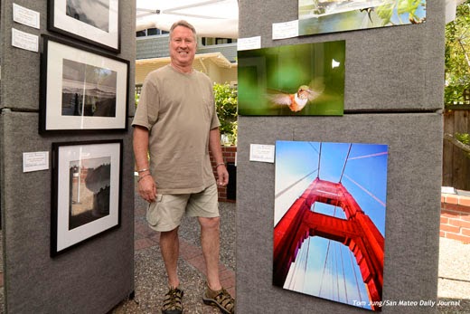
Another photographer, Ken Mahar, had a display of his own (Photo #6). Unlike Steve, his photos were displayed on commercial "walls" which blocked some of the offending skylight. I reset my camera to a more outdoor appropriate setting and bounced a speedlight off the ceiling of the protective tent. The glare, while still present, is not as obvious as Steve's flat display, but visible if you look for it. You can easily see the reflections of other photos in the hummingbird image. I submitted this as an alternate photo, since it says "photographer standing beside his photos", pretty much as you might find him at a street fair on a summer day.
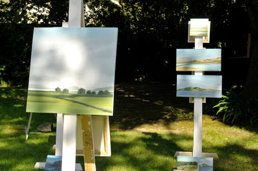
In the case of Susan Olsen, I had chance to practice some new lighting techniques. The problems can be seen in this sketch shot (Photo #7). First, portions of this image are being lit by dappled direct sunlight, so exposure would have to be brief, the ISO value low, and the aperture small (1/200, F 5.6, ISO 100 equivalent). The goal was to not blow out the highlights in the painting but provide enough artificial fill to bring the shadow areas closer to the highlights.
 |
| Photo #7 |
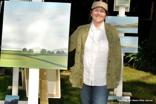
From the base exposure, I underexposed it by one stop (1/200, F 8.0, ISO 100 equivalent) and used a remote SB-800 at -1 stop of exposure to add the stop back in the highlights while providing an underexposed fill light for the shadows. As an additional trick, I allowed the commander speedlight to add a bit of light (-2 stops, I believe) to fill the shadow under the bill of the baseball cap. By inverting the camera, the light came from below the lens axis, providing some detail on Ms. Olsen's forehead (Photo #8).
 |
| Photo #8 |
 |
| Photo #9 |
You can see that the painting has no blown highlights, and that the shadows from the surrounding trees blend into the texture of the clouds in the painting, an accident that worked in my favor. You can see by this enlarged portion (Photo #9) that there are actually two shadows, something that isn't obvious when viewed from a distance. Shadow Line One is created by the sun, and crosses the bridge of Ms. Olsen's nose. Shadow Line Two appears on her forehead and is created by the remote speedlight. The on-camera Commander creates no shadow of its own, but provides a tiny bit of fill at the upper edge of the forehead. If you examine Ms. Olsen's neck, you will see tell-tale double shadows: The shadow cast camera left from the sun, and one cast camera right by the speedlight. I was reminded of a suggestion made by Joe McNally about dealing with multiple light sources: If I had aligned my remote speedlight perpendicular to the sun, I would have still had double shadows, but they would would be less obvious since they were coming from the same direction. Too soon old and too late smart, I guess.
I was grateful for the chance to do some lighting experiments on this assignment. All of my subjects were very gracious with their time, and particular tolerant of my efforts in setting up the indoor shot. I learned a lot from the outdoor shot, and am anxious to apply what I learned on a future assignment. Perhaps I should remember to bring a polarizing filter to tame some of that glare. Looking back, it might have been just the ticket.

