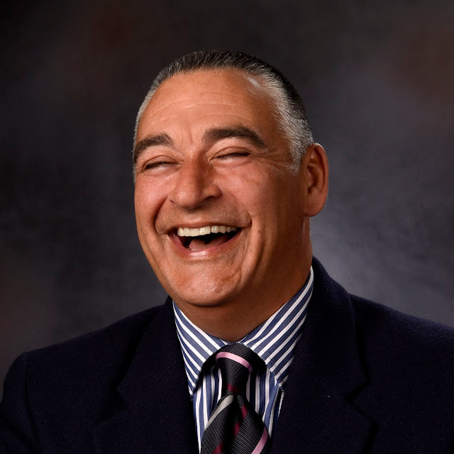
After 32 years working as an adult educator, it's time to call it quits. In the vernacular of the 70's, I'm officially "short', or within 100 days of the end of my tour of duty. Trained as an educator, worked as an educator, and retiring as an educator is something of an anomaly these days, but an opportunity I am profoundly grateful for.
LinkedIn: One of my final duties was to create a lesson plan for a series of classes to address the advance of digital technology into the area of job hunting. My idea was to present three classes: Effective Business E-Mail, Resume Fundamentals, and Creating A LinkedIn Profile. My goal was to start from a strong resume and use the text to populate the Linked In profile. The final step would be to provide each student with a suitable professional-looking photo for that profile. Even though it was a small class, I was determined to give it everything I had.
Lighting: For lighting, I followed Monte Zucker's classic two-light setup: A large key (main) light source (a Wescott soft box) and a hair or "kicker" light (a small soft box with an egg crate grid). Fill light was provided by a soft silver reflector opposite the key light. I added a small speedlight with a parabolic reflector was used as to light the background for a total of three.
 Check out my simple lighting diagram. With the subject in the center, we see the following:
12:00: The speedlight aimed at the background:
02:00: The kicker light, a smaller soft box with an egg crate,
05:00: The soft-silver reflector,
06:00: The camera, and
08:00: The large Westcott soft box, angled slightly away from the subject, would edge light the subject and provide lots of light for the reflector.
I have used this setup without the 12:00 background light when used with a shoot through umbrella, since some light from the main light source could be feathered to light the background. While this works, the two-light setup can be hit or miss, and I wanted to experiment with a dedicated background light.
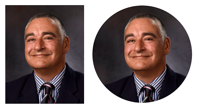
Format: Linked In will upload the user's profile image and present it in a circular format. To insure a reasonable composition, I decided to shoot using a square format. I could have used a Fuji X- body, but went instead with a Nikon D7200 DSLR with my 24-70 2.8 lens. Even though I would be wasting 33% of my pixels, there would be more than enough for a good, sharp image.

Using this more convention pose, you can see that the square easily transitions to the round format. Looking back, the circular crop might look better if it were position more to camera right (better shoulder balance), but since it would appear no larger than a nickel on most computer monitors, I would be splitting hairs if I were to attempt another crop. The left shot, cropped to a convention 8x10 format, looks just fine.
The class was quite small, and while not sustainable without more students, it may pave the way for similar classes in the future. Having two hours to produce a half-dozen head shots was more than enough time, so I spent as much time as I needed to get the best possible results.
 The next day I received a lovely note from one of my subjects. I printed her comments here.
"...I really appreciate all your time and effort in having our pictures taken and for the lessons for effective communication. My children commented that I look great and my photo was taken by a super professional photographer. I said that Tom is very professional and kind indeed..."
This made it all worth my while.
Some technical hacks will be described in a future posting.