Sunday, May 31, 2015

Photographing Award Ceremonies


The Editor In Chief of the newspaper I photograph for received an award from a statewide educational consortium representing the school I teach for. Here was an opportunity to make a photo of my two bosses.

The requirements for shooting events are pretty straight forward. Use flash. Choose a suitable vantage point. Set the camera to a relatively high ISO so that the flash recycle time will be brief. Say something so that the subjects will look your way. Consider your first shot your only shot.

This evening, I opted to aim my SB-800, zoomed to the most narrow beam angle (105mm), at the ceiling behind me so I'd get even front-to-back lighting. Camera was a Nikon D600 with a 24-70 2.8, ISO set to 800. The dining room's white ceilings would make an excellent bounce surface. I attached an SD-8a supplementary battery pack to the speedlight to cut my recycle time. Immediately after the shot is made, I'll usually say, "Hold it!", and make a quick check of the LCD display. If the shot looks reasonable, I'll make eye contact and say, "Thank you!" indicating that they are free to go.

As the recipients received their plaques, they "instinctively" turned to face the camera, something that public figures are used to doing. They usually give great smiles, and are patient enough to wait for the flash to go off, a simple indication that the shot was taken. Sure, one shot is really all you need, but what if it sports some minor flaw?

Now here's the spoiler alert: Plaques tend to be highly reflective metal.

The shot to the left required a retake. Our honoree inadvertently tipped his award up slightly, creating a perfect reflection of the light bouncing off the ceiling behind me. This can be a problem with ceiling bounce because the bounced light source covers is so very large. 

When I glanced at the image in the LCD display, I saw what went wrong, and said, "One more, please!" and proceeded to make a second shot. (I know how to say, "Uno Mas" too!).

Now you can simple tell your subject that the award must be tipped forward slightly, assuming that the s/he can actually hear you, or as is the case with some of my subjects, understands English. So when words fail me, I shift to Plan B  and channel my inner Marcel Marceau and demonstrate, with my hands, exactly what I want my subject to do. In this case, my subject immediately got the idea, so I made the shot and gave a "thumbs up" sign, a sign that we were finished.

So after a bit of correction, I made a second shot.Unfortunately for me, the subjects actually changed. Sure, I now had the plaque properly rendered, but my main subject's smile turned into a smirk, and I lost eye contact with the presenter on the left.I sent both of the images to my Editor in Chief and asked him to choose. Which would you have gone with: Good Facial Expression, or Well Rendered Plaque?*


I took this shot of an award recipient and his sponsoring teacher. In this case, the ambient lighting was so low I gave up on it. By shooting at a slightly lower angle, I was able to get get the ceiling lights in the background. I bounced the flash off of a wall behind me. I sent a copy to the student's school principal for anyone to use, since the the student didn't live in our service area and wouldn't be printed.  

Lest We Forget: Remember that you really don't have a lot of time to make adjustments, and my making the second shot was an act of desperation. Also, if you flub it, a dining room with 300 guests will be there to witness it. And finally, like it or not, the picket fence really was the shot you were sent to get.


This photo of award recipients from a Mock Trial shows that I learned my lesson. A generally pleasing photo where I nearly got all of the "legs" properly positioned. A good shot otherwise, with everyone, save one, looking directly into the camera.

*My Editor chose the Well Rendered Plaque.

Monday, May 25, 2015

Carnaval 2015 San Francisco


Carnaval 2015 has come and gone, and I realized that my enthusiasm changed a bit over the years. While I claim to love being in the presence of "scantily-clad women", I was a bit more introspective this time, determined to make photographs technically better than those I took in 2013. That was also the first year I checked in at the Press Center and got an official Event Press Pass. And with that came my membership in a huge, self-serving publicity machine. Photographers are encouraged to become a part of the event and share their images with the event website to give the wider public a better view of this San Francisco-style cultural event, writ large. Hey, I've been photographing Carnaval since 2008. Slam dunk. Bring it on.

What caught me by surprise was this year's overcast skies, initiating a subsequent re-thinking of my exposure solutions. I quickly realized that my usual flash fill approach was a little heavy handed when shooting under a heavy cloud cover. As it turned out, I found myself seeking out individual subjects, faces that spoke to some aspect of the event, rather than the more populated, and well choreographed,  performing groups.

Flash Gone Good: Flash still has its place, even under flat lighting conditions. Overcast skies do produce shadows, usually just enough to prevent catchlights from appearing in my subject's eyes. And even though my on-camera flash produced only a tiny bit of light, its just enough to even out the exposure considerably. For these two shots (left and below), I used a 12-24 wide angle lens on a D70 body, and a neutered SB-28 speedlight connected with an SC-17 flash extension cable. In both of these shots, the flash isn't that obvious, although the tell-tale shadows under my subject's chins is the giveaway.

One thing that I discovered: non-TTL flash automation did not work particularly well under these lighting conditions. I can't explain why this is so, but I was forced to shift to manual settings. This turned out be a wise decision, as I tend to set my flash at a lower output level. This helped the flash take more of a "back seat" during the exposure, so much so that the flash fill is barely visible.


Flash Gone Bad. If these two photos (left and below) photos are an accurate representation of Bolivian People, I want to get to know them better. The first thing that I noticed was the stuffed animal. I thought about it a moment, and realized it was a spoof on the "Guinea Pig on a Stick" street snack. In this flash shot, I held the flash high over the camera. and was rewarded with (or punished by) a shot where the nose shadow crosses my subject's lip line, a lighting no-no in portraiture. You can also see that the background is seriously underexposed, the result of having set my camera to my "blue sky background" exposure combination. Granted, the exposure difference between the foreground and the background give good separation, but the image would have a muddy appearance if it were published.


For the candid shot (above), I switched to a 70-300mm zoom which helped make the background an integral part of the composition. True, I lost some eye detail, but I doubt that a little shoe-mounted speedlight would have had any effect. But seriously, it's the background that makes the photo.


I started concentrating on individual subjects, using my long lens to get up close and personal. This gentleman was shot with my lens set to a focal length of 230mm. Making this shot at this setting would have been an impossible feat if it didn't have Vibration Reduction.


For selfies or Instagram photos, the Smart Phone has become ubiquitous, even here at Carnaval. Performers find some very creative places to put them while they're performing. Not that I was looking for them, but they'd pop up in the darnedest places.


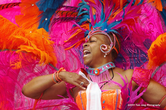
The photo (above) was something of a save. Here, the one hand is visible and actively involved, and gives the image something of a "floor" to keep the viewer focused on the performer's face. I loved the visual explosion of reds, pinks, and oranges, and knew there was a "winner" to be had for the taking. I made about a dozen exposures, this being my second shot.

I continued to shoot, trying to keep the composition as tight as I could. I made a conscious effort to get shots where one (or both) hands are close to the face. This allowed me to pack as much visual content into the image area as possible. I would have lost a good deal of impact if I was forced to zoom out to captured some outstretched arms, so I kept trying for a tight composition. I thought I had the shot when my subject raised a whistle to her lips to punctuate the beats of the nearby drum corp. But when I checked it during post production, I realized the whistle was nowhere to be seen, and a viewer might assume she was plucking something from her mouth. Funny how important showing a tiny bit of that whistle could have been.


This final shot was a gimme. The reflections from their belt keepers provided  enough detail to identify the two Police Officers, who essentially keep the viewer's attention on the stilt-walker in the middle of the image.

OK, I did have a good time. I'm pleased with the results. I'll be back next year. And maybe I won't bring a speedlight.

Sunday, May 17, 2015

Velcro Back to Back

Photo #1

I found something that should be of interest to anybody who has had to wrestle cables and extension cords as part of their daily pursuits. For me, keeping 50’ electrical extension cords neatly coiled is one of those minor annoyances. I had tried to solve the problem with ball bungees, but they tend to weaken when kept under the constant tension. A less expensive alternative was found in cloth-backed Velcro strips. I simple cut a 3” strip of the hook portion and one of the pile (fuzz). In use, I attached the two strips together, hook to pile, to a finished length between 4” and 7”, depending on how much the two pieces overlap.

I found a better solution at JoAnne’s, a fabric and craft store chain. In the Velcro section, I found rolls of fabric-backed Velcro strip that has hooks on one side, and pile on the other (Photo #1). In use, I found the length wasn’t critical, since the strip could just attach to itself anywhere along itself. For now, I’ll attach a “stitch” (small piece) of Gaffer tape over the hook side at one end of the strip to make it easier to remove. You can see in Photo #2 that I pealed back the outlay so you could see the hook and the pile.

Photo #2
For now, I’m going to use this double-backed stuff for binding applications where the elasticity of a bungee cord isn’t necessary. I’ll keep a few in my camera bag, just in case.

This hasn't been a grand post, but this stuff may remove one tiny irritant from your daily cord-wrangling routine. I know it will from mine.

For those who can't get to a JoAnne's, or prefer to order on line, I found it available here.

Sunday, May 10, 2015

DIY Light Stand Extension

I usually keep a Manfrotto 501B Compact Light Stand with an umbrella clamp and a Zumbrella in the trunk of my car. According to the catalog specifications, the 501B extends to a maximum height of 74" and collapses to under 20". They are extremely popular among Strobist fans, since they allow photographers to utilize off-camera flash without employing the aid of a voice actuated light stand (friend who can take directions).

While I like the light stands portability, I have often wished that I could get a little more height from the unit. If memory serves, there was a light stand, sold through Midwest Photo Exchange, that included a built-in boom extension that could conceivably be intended vertically to add some height. Alas, like the CIA, I can neither confirm nor deny the existence of said stand. But the idea has some merit.

Update: June 4, 2015: Click here to see the SP Studio Systems SPBLS32 Combo Boom/Light Stand.


Confluence of Ideas: Photographer Zack Arias, in a blog describing  his portable equipment options, mentions his use of a 1-foot length of 1/2 copper pipe as an extension when using a shoot-through umbrella. He writes:

"...The 1/2″ copper pipe with a swivel adapter is basically a handheld solution to hold a light in one hand and a camera with the other. We’re talking no light stands! And questions from TSA as to why there’s a pipe in your bag. So far so good..." 

 After reading this, it seemed to me that a  piece of copper pipe could also be used to to extend an existing light stand. I had just modified an Impact Umbrella Bracket to accept larger 1/4 x 20 thumbscrews, and remembered that the there were two spigot holes, one horizontal and one vertical, at each end. I reasoned that if I turned the bracket sideways, there would be two vertical holes.

 Well, it worked. You can see the umbrella bracket with one end clamped to the top of a standard light stand and the other clamped to a length of copper tubing. (I removed the thumbscrew and put the clamp handle on the underside to make setup easier to see). This would give me a little extra reach for any 5/8" light stand, or a short handle for an umbrella - speedlight combination, if needed. Notice that I rotated the umbrella clamp to get the stand and the extension as close together as possible. This would minimize any additional torque this slight offset might introduce.

Technical Stuff: Copper tubing is measured by its inside diameter. This threw me at first: Why would Zack use 1/2 tubing? Because when you add in the wall thickness, you get a 5/8 cylinder, which is exactly what you want. When you buy your tubing, be sure to check the outside diameter, just to be sure. 
Find it here.
In my photographs, you'll see that my tube looks more black than copper. To give my kluged light stand extension a more professional look, I applied several coats of Birchwood Casey's Brass Black to the surface, and wound up with a black that was both deep and rich. I used some #0000 steel wool to brighten up the surface, followed by a quick cleaning with denatured alcohol. The procedure was pretty simple: Apply Brass Black with a paper towel to the tube, wait one minute for the oxidation to occur, rinse the tube with water, dry it, and repeat. It took me about six or seven applications (I lost count), but made for a nice finish. I have to keep reminding myself that the tube will get scratched, and that I shouldn't get too attached to the finish.

Some Cautionary Notes: This is not a terribly stable modification, as it adds additional weight to light stand that isn't that strong. In a pinch, the extension could be in clamped horizontally to make short boom arm, but that would be pushing it. But is and when I do, I promise to use my camera bag as a makeshift sandbag. But if used indoors and with extreme care, this extension should work out reasonably well.

Sunday, May 3, 2015

DVD Favorites: Handling People and Situations


This photo of my friends Lee and Evelina was taken in 2005 during my first digital wedding. This has always been my favorite wedding image, not just as a testament to a long-standing friendship, but an example of when almost everything went right. It was also taken in my pre-DSLR days, using Vivitar speedlights mounted on flash brackets triggered using Wein Safe-Syncs for protection from high triggering voltages. This is the exact image that hangs in their home, made long before I learned about reducing glare on my subjects' noses.

With the exception of the digital camera (a Sony V3, if I remember correctly), this was completely "old school" photograph. I set up a mini-studio in an ante room of the church, complete with portable background and lit with a Norman flash shot through a Westcott softbox. The setup was right out of Monte Zucker's playbook, and the results were both classic and pleasing. 

Immediately after that wedding, I set about looking for ways to improve on what my first digital wedding experience taught me. My first stop was the book section of my local stocking dealer. 

I soon discovered that most books covered equipment essentials in such detail that one might come to believe that equipment was the most important factor, a misconception that fueled my personal buying habits. It wasn't until I was able to actually see master wedding photographers at work that I re-directed my emphasis on how great shots were made, instead of what equipment was used.
 
Photo Vision.  Photo Vision was probably the single most influential resource for improving my photography. It is a bi-monthly subscription DVD magazine that has been a real eye-opener for me, and I cannot recommend it highly enough. While the series' emphasis is on high school senior, wedding, and portrait photographic techniques, equal time is spent on the marketing, sales, and the customer service aspects of the industry. I own all of the wedding and portrait packages, and I believe they are some some the best investments a "people photographer" can make. Just a reminder, fellow photographer - what you do isn't only about cameras and equipment. It goes far beyond the camera models, fancy lenses, ISO settings and F-Stops. It's about making connections and working with your subjects, and gaining their trust as you do your best to present them at their absolute best.

The Photo Vision series' strength is the "ride along" approach to wedding photography. You'll get to see an actual wedding being photographed by several giants in the industry, and you can see exactly how they arrange shots, how they work with their subjects to get exactly what they want. This eventually translates into a look that identifies the photographer and strengthens his/her brand recognition.

I didn't realize it at first, but the wedding photography embodies most of what I find interesting about editorial photography: Working with people, facing lighting and location challenges, and an often exciting environment that forces you to think on your feet. But at this stage of my life, I'm not willing to commit the time to the post-production aspects of the sale, and have found the editorial photography provides nearly all of the challenges without the post production commitments of time and energy. 

David Ziser has probably influenced my technique more than any single photographer. I attended several of his wedding photography seminars, and found him the perfect Southern gentleman with a direct, no-nonsense approach to wedding work. His clientele tends to be more high-end traditional wedding work, and is proud of the number of new clients whose parents were old clients years ago.

What impressed me about David is his practical approach to equipment and technique. One key takeaway is how much he depends on his assistant to "know" how to properly position a minimal amount of off-camera lighting to produce dramatic, yet timeless, bridal photographs. If you have a limited budget and could only afford one DVD, this would be my choice, in spite of its age (He was using Nikon D1X cameras, which were introduced in 2001 and sold for over $5,000 at the time. That was a LONG time ago!)

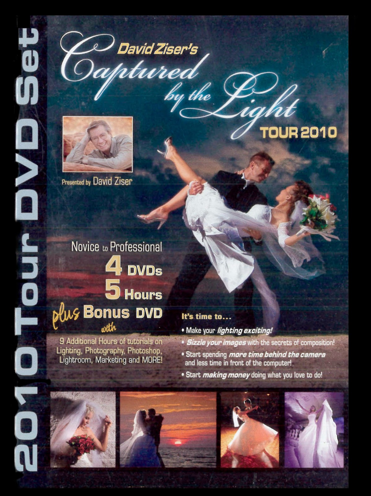
In 2010 David authored Captured By The Light which coincided with his national tour, which I attended. The tour DVD does include something very special: A tutorial for Photo Fusion, a relatively simple album editing program. This was the program I used to create Rene and Brad's album, which was the high water mark of my wedding photographer exploits. If memory serves, there is no mention the program in the book, which Mr. Ziser sold as a bundle during his tours at a very attractive price. 

One quick note: (May 5, 2015) I visited David's on-line store and found that his instructional DVDs were VERY DEEPLY DISCOUNTED. I suggest that you check out his DVD sets now and save big.  Pick up a Zumbrella (or two) while you're at it.

Just a reminder to the younger readers: There are fewer and fewer practitioners of the "classic" wedding photographic package. At these bargain prices, you would do well to observe an old school approach. Remember that a client wishing a 30" X 40" wall portrait may well want a more traditional photo, taken in the classic style that David is so well known for.

Sandy "Sam" Puc (rhymes with "butch", really!) is a Denver family photographer specializing in families and kids of all ages. She definitely has a sure-fire approach to getting, and keeping, her subject's attention when she works. On her last visit, she (literally!) had a member of the audience, complete with three kids, come on stage for a demonstration of her rapid fire working style. Her video is full of tips on how to keep a child's attention, along with a variety of marketing programs to boost sales and maintaining customer loyalty.

This video set would be more suitable for a photographer working with children and families both in studio and on location. She once told the story during a live presentation of the time she was photographing on location, and discovered she had posed her subjects right on top of a nest of hatching spiders.

I'm going to pretend that Sam and I a great buddies (I wish we were, and it's not for a lack of trying on my part!). She has always been in incredible philanthropic force in Denver. To me, her most notable contribution was creating Now I Lay Me Down To Sleep, an organization the enlists the services of volunteer photographers to provide loving portraits of terminally ill children, so many of them newborns and infants. She is a wonderful example of a photographer involved in her community, using her photography to help a variety of charitable causes.

Summary: These DVD packages can do wonders to expand a working photographer's experience. Actually seeing how these photographers handle the challenges of the profession will serve you well, especially when you pose YOUR subjects on a nest of spiders!