Tuesday, May 31, 2022

Memorial Day On The Peninsula


There is one certainty when photographing community events, and that is you never know when a better image may come along. Unlike editorial photography where there is a specific goal, photographs submitted from events may not have a specific person or thing to highlight, so it is up to the photographer to make an image that best represents the "vibe" of the gathering. This weekend there were two different events, and each served two different purposes.

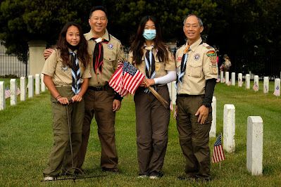
The lead photo was from the annual flag planting ceremony at the Golden Gate National Cemetery in San Bruno. It had been cancelled last year due to the pandemic, and many still took the precaution of wearing a mask. Most of the participants were Scouts for the area, and now that young women are becoming more common in local troops, I really wanted them to be represented. 

Lens Choice: Normally I would bring my "big guns" to the event, and when I was shooting Nikons, my kit composed of a three bodies: One with a 24-70 2.8 Nikkor on a  D600 (full frame) body, a 70-200 2.8 Nikkor on an APS body, and a Sigma 150-600 lens on another APS body, if I remember correctly. I always carried the Sigma, as one time I actually needed its long focal length to do some major visual compression. I don't know how much all this stuff weighed, but I do know I was always exhausted when I was done.

This year, I had an epiphany: Since I was shooting outdoors, I didn't need to bring those F 2.8 lenses, which are quite dense. My Fuji kit consisted of a X-T1 with an 18-55 F 2.8-4.0, the Fuji X-mount "kit lens". My X-T2 body was fitted with a 55-200 F3.5-4.8 lens. I still carried a third camera, a Nikon D7200 riding on a 200-500 F 5.6 Nikkor, the lens that replaced my old Sigma. In terms of perspective, I had a focal length for any situation, and lightened my load by a considerable amount. 

Directing My Subjects: For the record, I did some directing on my two young subjects. This was limited to having the "flag lady" kneel when she planted the flag, and had her hold the unused flags a little higher for better visibility. I'm not pretending that I didn't have any contact with the subjects, which is a basic tenet of ethical photojournalism, but to my defense, they were actually installing the flags, so I wasn't actually influencing what they were already doing.

Proud Fathers: I worked with these two Scouts for quite some time, so before long their fathers drop by to see what was going on. After introducing myself, I asked if they'd like to have a photo with their daughters, and they were delighted. Think about, it only took a minute or two to make the shot, pretty much exactly where they were already standing. I must say that the Goddess of Lighting was watching out for me, because all of the photos taken in the series had the soft lighting of a cloudy-bright day, so there is plenty of form-defining shadows in their faces. It doesn't get any easier than that.
Sunday, May 22, 2022

Assignment With A Sign - TheatreWorks Silicon Valley

It All Started With A Sign: This was an assignment full of promise: A theater marquee, taken at twilight, the name of the event lit up for all all to see. Beneath the sign, Executive Director Phil Santora and Trustee Julie Kaufman, looking like Gene Kelly and Jean Hagen (Don Lockwood and Lena Lamont) on opening night, just basking in the warmth of devoted fans*. Alas, it was not to be.

Reality set in when I found out that this marquee "photo" was the product of some clever Photoshopping. Now I had less to work with. I was going to be photographing professional administrators who were busy keeping a non-profit organization running really smoothly instead of fictional characters from a 1950s musical.

What a photographer wants and what the subjects are able to provide often don't match. Time would be tight and I had to choose one of two possible time slots: 6:00 pm, and 1:00 - 1:45 pm the following day. There went my twilight sky, since sunset wouldn't occur until 8 pm. There was going to be lots of sunlight when the photo was taken. I took the 6:00 pm appointment, and hoped for the best.

The Fox Theater is on the south side of Broadway street, so I expected that the marquee would be in shadow. When I arrived at 5:30, I found that one face was in shadow, and one face was in full sunlight. If I chose the shaded side, I'd need to extend my light stand to aim an accent flash the log, and hand hold a second flash to illuminate my subjects. If I chose the sunny side, I'd probably have squinty expressions and some off-the-chart overexposure. 

As luck would have it, there were some benches and a convenient shade tree as you can see at the right of the frame. This meant that I wouldn't have to deal with direct sunlight on my subjects and could then light them with flash. Since I was outdoors. I didn't use and umbrella for fear it would be blown over by the wind. If I added weights to hole the lightstand in place, I could technically be required to have a permit to "block pedestrian traffic". So the flash was used "straight" with no light modifier. In some cases, the position of the light is more important than its quality.


Once I established the desired exposure for the theater logo, I could move my subjects until their heads covered the marquee. I would finally adjust my flash output to get proper exposure on my subjects. Unfortunately, positioning the subjects is an "on the fly" thing, and you can't know in advance exactly where the  subjects will be standing. Had I known the exact position, I could have looked up and aligned the flash for best effect. I suspect the flash was aimed too much towards camera right, resulting in some underexposure. Dodge and burn, dodge and burn, I managed to get a reasonable image, but certainly not of the best possible quality. I'm quite sure that by the time the photo is published, the degradation that all newspaper images suffer will conceal all the deficiencies that are currently driving me crazy. Or if I'm lucky, the image will be printed in black and white. Despite its shortcomings, my Editor declared the photo "VERY nice!". High praise indeed.

Depth Of Field Control: One aspect of the shot did merit some additional thinking. I was shooting at F 10.0, which gave me great depth of field. But what if I had installed a 3-stop neutral density filter? The shot could have  been made at approximate F 4.0 which would taken the sharp edge off of the lettering in the background. I've always had access to ND filters, but can remember using one only once for a published photo. If I think of them for depth-control rather than exposure control, I would be tempted to find space in the Big Bag and slip one or two in. I've owned a variety of Cokin filters, and maybe it's about time I started using them.

*Opening scenes from the movie "Singing In The Rain".

Monday, May 16, 2022

LaVar Burton - Fox Theater, Redwood City


Image Credit here.
Geordi La Forge: I do not consider myself a Trekkie. When the first Start Trek iteration aired in the late 60s I was probably watching something else. It wasn't until it ran in syndication that I came to appreciate the show. Perhaps my emotional age finally caught up with that of the original target audience. But I digress. HIP (Human Investment Project) Housing was celebrating its 50th year of helping people find safe and stable housing, and LaVar Burton, the blind Lieutenant Commander for Star Trek: The Next Generation, was the guest speaker. His credits also include his breakout portrayal of Kunta Kinte in Roots, and being the longtime host of Reading Rainbow in addition to 13 Emmys, 1 Grammy, and 5 NAACP Awards. And if that wasn't enough, he directed several episodes of Next Generation. Quite a curriculum vitae, or whatever they call it in Klingon.

I discussed my needs with the HIP Event Coordinator, and we agreed that that I should arrive at 4:00 to scout out the location and shoot some available light photos during Mr. La Forge's Burton's on-stage discussion with Kate Comfort Harr. After Geordi's La Var's exit, there would be an auction, followed by a Meet And Greet at 7:00 pm. I had discussed the possibility of making a photo that included the two HIP co-founders, and hoped they could stay around to make this photo with Mr. Kinte Burton. When the speeches ended, the stage was cleared, leaving only the two chairs. A HIP Housing backdrop (not shown) was installed behind the two chairs. Very Red Carpet.

Those who registered for the Meet and Greet would be seated next to Mr. Burton and have a photo taken by a staff photographer. 
When I learned that the two co-founders had left for the evening. I thought about what I could do next,  If I could find two HIP executives to pose with Mr. Burton, I could still get a meaningful shot. As the M&G proceeded, I decided to use the theater itself as a backdrop. A few quick sketch photographs proved that it was was entirely possible. I decided that I'd use a conventional Daylight White Balance preset, since I wasn't really happy with the colors produced by a CTO gelled flash. By going with Daylight, that one variable was eliminated. The on-camera flash head was turned rearward and aimed at the HIP Housing backdrop which was, luckily for me, reflective and white.

The first sketch shot pointed out some flaws. First, I had to alter my shooting angle to avoid the light bisecting some heads. Secondly, I needed to minimize the sparse look of a theater being cleaned up after the show. And finally, I needed to do something with their hands. As a general rule, one should include the subject's arms in their entirety whenever possible. Legs you can't do much about, but an absence of hands is a little unsettling. Since all the subjects appeared to be in good spirits, I asked if they would do a "Chorus Line" pose where they held hands as though preparing to bow to an audience. They were comfortable with the idea, so the next shots would be posed accordingly.

For the final image, I had my tallest subject take a half-step away from the camera. This brought her perceived height closer to Mr. Burton's. Also, all three heads cleared the lighting fixture in the background. While I liked the final shot, I should have had the two ladies bring their "outside" hands where the camera could see them. This would leave no doubt in the minds of the viewers that my subjects were duos utebatur*. I must say that I think their smiles do all of the heavy lifting in the photograph. The Daylight preset gave the theater a warm appearance, and the tight cropping made the deconstructed seating area all but invisible.

From The Enterprise Bridge: I searched the web for a La Forge quote to use as a closer. I liked this one the best.

"What can I say? To us it's a slime pit, but to them it's home"

Live long and prosper. Oops. Wrong Generation.


*Latin translation for "two handed"

Sunday, May 15, 2022

Directional Non-Directional Light

May 11, 2022

I learned something important from this shot. I was on the shady side of the street, and assumed that this was a shadowless, open shade exposure. On viewing the photo, I saw an unusual richness and texture in the concrete lion. Once I noticed the shadows on the frame of the garage door in the background, I realized that the light actually had some direction. Perhaps there was some sunlight bouncing off of a house. At any rate, there are shadows and visible texture on the surface.

I recall watching an instructional video by a photographer who used his hand to determine the direction of existing light sources. By placing his hand in the palm-up position and raising one finger, he could see from the shadow the direction of the light was coming from. While this sunlit digit is pretty easy to analyze, it might not be so obvious on a cloudy day. 

I am sure that from now on, I won't take the direction of the key light for granted, especially when shooting in locations where the sun might encounter some natural light modifiers. Just be cognizant of which finger you decide to use.

May 14, 2022

Addendum: This was the first time I encountered a Frenchy immortalized in concrete. It was sitting in the same "open shade" environment as the lion.  By observing the faint shadow in the palm of my hand, I saw some reflected light from the buildings across the street. This faint but directional light makes it easier to see the details around the eyes and below the chin.

There are two takeaways from this exercise. First, you may  need help to determine the presence of you main (key) light when working in compromised lighting environments. This would include variations on Open Shade, and indoors, where there may be several artificial light sources, each competing to be "key". Second, true open shade seems to be a rarity in the Big City, since you will always have buildings reflecting light onto your subject unless you only work outdoors in wide open spaces.

Awareness of the direction of your key light, however faint, is important.

Sunday, May 8, 2022

Maybe We Need To See Less Of Each Other

Photo from Wikipedia.
I was at Seawood Camera in San Rafael a few weeks ago, and even though I had no business doing so, I checked to see if there were any pre-owned Fuji digital cameras for sale. I purchased 2 Fujis there, an X-Pro2 and my second X-Pro1, and was actually hoping to see an X-E2 body. Instead, I saw a used X-Pro1 with one of the newer WR prime lenses. Much to my surprise, I didn't give a second thought to owning a 4th X-Pro body. I looked at its $1000.00 price tag and moved on.

Why the change of heart? Having three X-Pros in my collection wasn't it. Heck, its never stopped me from buying duplicates, triplicates, or quadruplicates of things I really liked. It's just that after using one almost daily for over a month, I can say that the shortcomings of this first-of-its-kind cameras have become a bit harder to accept, considering that faster, more modern Fujis are in my collection.

For the record, my X-Pros had all of the proper firmware upgrades, so they're all on their best game. But I've experienced some subtle difficulties that might be overlooked by a younger pair of eyes.

The Optical Viewfinder: Much of the X-Pro mystique is built around the Optical View Finder (OVF). As a feature, it offers a shooting experience similar to using a Leica rangefinder camera. In fact, the introduction of an adapter that would mate the Fuji body to an M-mount Leica lens was available at the time of the camera's introduction. Clearly the camera was meant to capture and retain Leicaphiles and turn them into Fujphiles. In short, the OFV was the gateway drug.

In practice, you still needed to revert to the Electronic Viewfinder (EVF) when you needed to establish critical focus. I say "critical", because many seasoned street photographers learned to "zone focus" their cameras, which is no more than guessing the distance, manually transferring that guess to the distance scale on the lens, and hoping that the depth of field for the selected shooting aperture would keep everything sharp. With the X-Pro1 in OVF, you pressing the Command Dial (white arrow) which toggles you into the magnified EVF when you are in the Manual Focus mode. Here Focus Peaking, plus the magnified image, certainly help. Pressing the Command Dial again returns you to the OVF mode. Using the bright line outlines, you'll need to re-compose your image before you shoot, just as you would have done with a Leica rangefinder (or Bessa, or Nikon, or Contax, ad nauseum). True to purpose, the X-Pro1 gave user the Leica experience particularly the focus-reframe-shoot process.

Lack Of Eyepiece Corrections (X-Pro1): When first introduced, I believe Fuji brought to market a digital camera that were trying to duplicate the look and field of the classic Leica rangefinder camera. Like so many cameras of the time, it was probably assumed that the user had 20/20 vision. If a user needed correction, it came in the form of small, screw-in eyepieces which came with several different strengths of diopter correction.  Even so, eyeglass wearers were bound to have more difficulty focusing, especially when confronted with bifocal lenses.

As I mentioned, critical focusing requires that the user revert to an iteration of the EVF. For me, I need the diopter adjustments that the X-Pro1 didn't have. The problem lies in my eyeglass correction. When using the viewfinder in either OVG or EVF, my eye is looking through the transitioning portion of my progressive lens, a never-never land of everything seems slightly out of focus. Diopter adjustments would be very helpful in establishing a compromise focusing distance. For now, I may ask my optometrist if the transition portion of the lens is more towards the lower third of the lens to give my eye better acuity when looking through the viewfinder straight on.

I may switch out to the X-Pro2 body, or even my older X-E1, just to see if I'm right. In the meantime, I stand by my contention that the Optical View Finder is best left to the purists with young, sharp eyes capable of rapid focus acquisition.

Saturday, May 7, 2022

Woodside Store Day


The Photo I Had To Make: The first of the requisite Four Bs of a good newspaper photograph (Babies, Babes, Beasts, or Blood) was represented in this photo, although in my world, "babies" and "cute kids" are one in the same. The context to link it to Woodside Store Days, the old fashion washing machine and clothes wringer, were there too. The focal point (where the subjects are looking) was apparent. With all of the boxes checked, I submitted the photo as soon as the caption was written, well before 7:00 pm deadline. The photo was destined for the front page, so with the photo "in the can", the pressure was off.

Woodside Store Day 2019
Past Efforts: I've photographed the Woodside Store Day event several times in the PP (Pre-Pandemic) years, and two photographs stick out in my mind. The one of the 2019 Pie Eating contest wasn't submitted because it consisted of two kids, their lips covered with berry pie filling. The young lady was smiling at her apparent victory, while the little boy beside her seems to be staring  disbelief. Since it really didn't have any visuals relating the event, it wasn't summited. 

The second shot, made in 2017, showed the interior of the store with rows of canned goods and farm supplies lining the shelves. One of the docents, dressed in a period costume, was in the foreground. The shot went over well at the office because, unbeknownst to me, the paper's Editor in Chief was standing in the doorway.

Woodside Store Day 2017
There were some things I would improve if given the chance. For one thing, the quality of the lighting on my subject was much broader than that on the background. The shadows on her face are extremely soft when compared to the harsh lighting from the incandescent accent lights mounted in the ceiling.
Second, the lighting appears a bit cool in contrast to the incandescent background lights. Lastly, the exposure was adjusted to so that details from the exterior would be recognizable. This underexposed the store's interior.

Five years hence, I thought I'd explore ways to improve the image. First, I decided to reframe the image to eliminate the door and give myself more exposure leeway for choosing the interior exposure.

This test exposure was based on what would properly exposes the merchandise on the shelves. By excluding the doorway from the frame, I didn't have to worry about blown  highlights.  Also, I went to some lengths to level the camera to prevent "stretch face" distortion in the corners, the so-called "wide angle distortion". This framing was achieved by holding the camera at waist level. Some slight convergence (vertical lines appearing to merge in the distance) exists, but it whispers instead of shouts.

1/35 second, F 4.0, ISO 1000

I was able to convince my subject to stand by the sewing machine and to pretend to study it. To simulate the high top lighting, I installed a diffusion dome on the flash and held it at arm's length high above my head. This gave me a medium hard shadow similar to those created by the ambient accent lighting. I did not gel the flash, so the lighting on my subject's face is close to true daylight.

Final Notes: When working with a shot where the background framing is critical, I have the subject move left and right, fore and aft, until his/her position is exactly where I want it. For this recent re-make, I just assumed the sewing machine was the subject to simplify any instructions I would be giving to my young subject.