 |
| 1/125 second, F 14.0, ISO 200, Focal Length 32mm (48mm in Full Frame Format) |
 |
| To view source, click here. |
When I was told that there would be three floral designers (two from Hillsborough, one from San Mateo) I initially decided that the photo would be made San Mateo's Central Park, a suitable location with adequate parking. I would pose them inside a gazebo that was located in the center of a rose garden. By posing my subjects inside, the lighting solution would be much simpler.
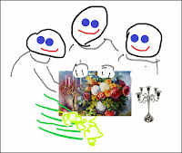
 I created this mockup with help from the Jack In The Box spokes puppets and then asked for approval from all of the stakeholders. Now I had to find a way to make this happen.
The Framed Painting: I borrowed an ornate frame with a window that was slightly smaller than 11x17 inches, the maximum size for a normal color laser printer. I saved the file on a thumb drive and headed to Kinko's where I made a color copy large enough to fill the frame's window. If you have to create a similar graphic, make several variations, each one slightly larger, because laser copiers won't give you a borderless print option. I then trimmed the print, sandwiched it between the glass the the foam core backing panel from the frame, and called it good.
The Vase: A quick trip to a charity re-sale store got me a $2.00 round vase similar to the one in painting.
The Candelabra: I found a sterling silver candelabra in an antique and collectibles store in San Mateo, and asked if I could rent it. The marked price was $105.00, so I was asked to leave a 50% deposit which would be returned, minus $10.00, when I brought it back to the shop.
The Flowers: These I would purchase at Trader Joe's an hour before the shoot. Since I was going "on location", I thought it safer to bring all the necessary props. It never occurred to me that flower arrangers have flowers, and could probably be asked to some a variety of colors.
Ready On The Set: By Friday morning, neither of my Hillsborough subjects responded, and my San Mateo was only available for an afternoon shoot. Rather than drag my lone subject to the Park, I arranged to make the photo in her neighbor's back yard. If you examine the photo carefully, you can see that I'm under a covered back porch. I attempted to align my subject with the only portion of the garden that could serve as a suitable background while being careful to stay off the lawn.
 |
| 1/250 second, F 14.0, ISO 200 1/250 second, F 14.0, ISO 200 1/125 second, F 11/0, ISO 200 |
You will notice that a landscape composition wastes a lot of space when there is only a single subject. I would eventually crop the image to a square format to give the editor a little latitude when it came time to fit the image on the page.
I had one flash left, and thought I could use it to brighten the shadows in the background to improve the visual separation. Since I didn't want to walk on the lawn, I couldn't get enough light on the background shrubbery, so I decided to instead create a "kicker" light by directing the light towards the back of my subject's head. Ideally, the light would be placed directly behind, and above, my subject. I settled on this shot where the light stand is visible (sadly) visible in the frame (see image at the top of this post). The light stand was positioned to prevent a highlight on the subject's nose. See below left.
 |
| Actual Photo: flash on light stand Future Photo: flash on boom |
Incidentally, I sent the photo with the lightstand intact. All of the images that I submit for Journal publication cannot be edited to remove visual content. The light stand was there, and (sigh) I must therefore include it. The few edits I will perform are to ensure proper rendition of both shadow and highlight areas.
Epilogue: It is unnatural to create a photo with excessive visually "dead space". As a lark, I re-cropped the image as an 8x10, cloned out the light stand and cleaned up the background a bit. When viewed this way, I believe my efforts to create a meaningful foreground were successful.
True to form, the paper did crop the image to a landscape format, and in doing so eliminated nearly all the details I tried so hard to preserve.
Next time, I think I can use the Adorama Flashpoint Mini-Zoom that already lives in my camera bag as a kicker. The flash has a rotating/swiveling head, variable power, a choice of radio or optical triggering, and its compact sized. Now I just need a lightweight boom way to position it. Stay tuned.


No comments:
Post a Comment