Sunday, March 27, 2016

Using CTO Gels

Life just keeps getting better and better when you go mirrorless. Well, sorta.

I’m still griping about the lack of a decent speedlight for those all to frequent “run and gun” situations where you need the help of TTL automation when shooting quickly under a variety of conditions. Certainly, flashes like the Yongnuo 560 and more recently the Adorama Li-On powered units can be perfectly suitable when there’s enough time to make a “ranging shot” to adjust flash output. On other hand, an older Nikon speedlight with non-TTL exposure automation might do in a pinch, particularly in flash fill situations where exposure isn’t critical, as in putting a spot of light into the shadows on a sunlit day.

True TTL was a major advancement, allowing accurate exposures to be calculated from within the camera and through the shooting lens. iTTL is far more sensitive, providing accurate exposures even when the amount of light on your subject relatively low, as it would be when bouncing off of high ceilings or over longer distances. But under these circumstances, the Fuji EF-42 just doesn’t have the horsepower or the fast recycle time. I considered buying a used one and adapting it to a Quantum battery pack, something that would be easy to do, in theory. Maybe next year…

In the mean time, I’ve decided to try using some older Nikon SB-80 speedlights. First off, I already have several of them, and they have the same control layout as my beloved SB-800s. And while they aren’t adaptable to Nikon iTTL cameras, they do have the non-TTL exposure mode. When fast recycling time is needed, I have SD-8a battery packs. Not as fast as the Adorama units, which are bulkier and lack the non TTL automation.

Photo #1
Gels: One of the great convenience points for the Nikon speedlights is the inclusion of color correcting (CC) gels or filter with the midrange and top end speedlights. When the SB-800 was introduced, it came with two gel filters: one for balancing incandescent, and one for balancing common fluorescent lights. These OEM gels use the wide angle filter plate to hold them in place, which makes it impossible to narrow the beam angle when using it in the bounce mode. I solved the problem by using a “stitch” (small piece) of gaffer tape to help hold the gel in place, a time-consuming operation when you do it in the field.

As with just about everything associated with my going mirrorless, I’ve adapted how I use my gelled speedlights, since flash is mostly a manual proposition. For my last assignment, I decided to go “paleo” and attach my gels with gaffer tape, even though my SB-800 gels fit the SB-80. I could now cut my own rectangular gels from Rosco sheets, saving a mountain of money in the process (Photo #1).

Photo #2
Gel Size: The gel’s height is cut to the exact height of the clear face plate so that there are no gaps in the coverage. The width is cut narrower than the clear faceplate. This provides a gap for so the tape can adhere to the face plate, which insures a light-proof seal on the sides, which are often irregular in shape. You may lose an infinitesimal amount of light, but I dare anybody to quantify it. Be sure to trim the tape to the same height as the gel. In this photo, you can see a gel with the gaffer tape “sticky side up” (Photo #2). While not readily apparent, the gel is narrower than the clear face plate.

The easiest way to attach the gel is to place each strip of tape sticky side up and lay the gel on top. When both side have their tape, you can trim the tape with a pair of sharp scissors. If you check Photo #1 again, you'll see that the arrangement is "light tight", and will produce the proper color throughout.

Photo #3
When not in use, just tape the gel to the side of the flash head (Photo #3). Be sure it mounted low enough so that it doesn’t get in the way of when you mount a diffusion dome. The strange reflection is a reminder of how easily they can be creased, something that doesn’t affect the gel’s performance.

In The Field: When I carried my Nikon bag, I always had three speedlights. With the Fuji bag, there are still three speedlights: one Fuji EF-42, and two Nikon SB-80s, one with the gel already mounted.This allows me to instantly retrieve a gelled, or un-gelled flash on a moment's notice. If for some reason I need all of the speedlights un-gelled, I found it faster to remove the gel than to try to tape in on properly when I needed it. And as it turns out, installing the gel from the side of the flash is much faster than fishing through my camera bag, removing the gel from its protective sleeve, and positioning it under the flash panel.

Rosco Gel Sheets: The easiest way to obtain a supply of gels is to purchase the Rosco Strobist Assortment. However, since color correcting for incandescent light sources is pretty much my "go to" gel, I found it easier to purchase the by the sheet and cut them to size.

Everybody talks about the "CTO", or Full Orange gel, but when I checked the Rosco catalog, there are two suitable choices:

#3407, or Full CTO, which converts 5500 Kelvin to 2900 Kelvin, closer to the color of a household light bulb.

#3401, or RoscoSun 85, which converts 5500 Kelvin to 3200 Kelvin, closer to the color of a Type B photoflood.

Either works, but the 3407 is a bit warmer, although I doubt anybody could see the difference 300 degrees Kelvin would make unless they were compared side by side.

Fuji X100 S with WCL Wide Angle Conversion Lens: 1/64 of a second, ISO 800, F 4.0
This shot was made during a lecture on England during the time of Downton Abbey. Lecture guests were invited to come wearing period costumes, so finding interesting subjects wasn't difficult. I used an SB-80 with a Full CTO Gel bounced off of the wall behind me. White balance was set to the Incandescent preset, as you would expect. The blue tint on the background comes from overcast daylight from the windows at camera right.

Sunday, March 20, 2016

The Park Service Commemorative Coin


The Mint: This was a neat assignment. I was going to the San Francisco Mint to watch the first strike of a new, 100th Anniversary Commemorative coin honoring the National Parks Service. Since I live relatively close to the mint, I thought the assignment would be pretty easy.

Media people entering the facility were required to have their identifications verified in advance. Once inside the Mint, we were escorted through the standard metal detection protocol, identical to what you'd encounter in an airport. One surprise was the stipulation that no loose change could be brought  into the mint. All of this security was a bit bothersome, since all I was doing was coming to make some "snaps".


The Press Release stated that there would be plenty of Photo Ops, and a large projected image of some redwood trees formed the backdrop for the speakers taking the podium. Here is the newly appointed Chief of Staff of the United States Mint Elisa Basnight, Esq., welcoming the guests to the event.

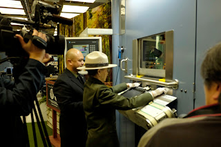
The honor of striking the first coin went to 94-year old Betty Reid Soskin,  the oldest National Park Ranger in the United States, who is currently assigned to the Rosie the Riveter/World War II Home Front National Historical Park in Richmond, California. At the conclusion of her speech, she turned to the giant press, and prepared to strike the first coin.

There wasn't much to see from my current vantage point in the isle beside the seated audience, so I moved closer to see if a better photo could be made. There wasn't much to see, and I concluded there weren't enough visual clues to help the viewer understand what was going on. It's just as well, since the photo is horribly out of focus.

The media was certainly present. An ABC video crew was to my left, and San Francisco Chronicle photographer Paul Chin was to my right. Mr. Chin did manage to get a shot, but he had the advantage of an entire article to support the photo, whereas I had only a few lines of text to work with.

After a faint "chug", the shiny new coin rolled out of the machine and was caught in special chute. Ms. Soskin picked up the coin with gloved hands, and showed it off the the crowd. By this time everybody who had a camera rushed forward, and started making photos at close range. I managed to get two, which can be seen below.
As you can see, I had some real difficulty photographing the coin. Subtle changes in the coin's orientation altered it appearance, and coupled with the variables of gaze and facial expression, the odds were not in my favor. Also, my position was a too far to camera right, increasing the perceived distance between coin and face.


Second Chance: Things were not going well. Then Ms. Basnight stepped up beside Ms. Soskin, showing off the second newly-minted coin. I re-positioned myself to the left so that the coin was more closely aligned with the face, giving me a much tighter composition.
As you can see, the orientation of the coin was critical. Only the second frame gives a hint of  the coins detail, and the image was in reasonably sharp focus. I leveled and cropped the image to get the following final version.

Almost There: Just about everything now fell into place. The coin was sharp, and Ms. Soskin was just a touch out of focus. You can see that my new position decreased the apparent distance between the hand and and the face, tightening up the composition. Still, I was bothered by the lack of detail in the coin. I knew I could live with this image, but tried to find a way to give the view a closer look at the coin.

I noticed that there was a display table beside the podium with two pre-production samples in holders on a black velvet background, so I quickly made a close-up of the "reverse" (tail) side of the coin to match the one held by Ranger Soskin. I left the Mint, thinking that my editor might choose to run both images, side by side, which I felt would be mutually supportive.

When I returned to my office, I looked over my final choice, and seeing the press in the background, felt it didn't contribute that much to the context of the photo. After a small bit of cropping, I superimposed the image of the coin over the upper left hand corner of the base image, resulting in the final image: A smiling Park Service representative, holding a coin, with a inset of the coin in the upper left hand corner.

I've seen photos like this before in publications other than the Journal, and while it was not a true "exactly as I saw it" photo, it's pretty obvious that the only bit of digital manipulation was the superimposition of the coin over the press. I added the black border to remind the viewer that there were indeed two photos, and no attempt was being made to hide that fact. My editor didn't object to the overlay, and the image ran on Page 2 the following day.

If you're curious, the San Francisco Chronicle ran their own story on Thursday too. You can read it by clicking here.

Sunday, March 13, 2016

Fairy Gardens

Photo #1
This assignment was about as random as they come. A scheduled event, no single subject in particular, and to possibility of making a really cute photo, if I was patient (and vigilant) enough to see it coming. Photo #1 was my first choice.

The 4 C's Criteria: In an earlier post, I put into words my unconscious criteria for rating the photos for submission. From that post, we have:
  • Content: Does the foreground reveal additional details about what is happening? You can see my subject is working on a small arrangement of plants, and appears to be pleased by her efforts. Her tiny finger adds to the sense of her satisfaction with the project.
  • Composition: Does the arrangement of you main subject/s keep the viewer engaged? The cropping could easily been square, since the left and right edges don't add much to the image. I did cut off the top of her head, which could be considered a cropping faux-pas, but in this case, the placement of the arrangement in the image and the direction of her gaze serve to guide the viewers to where they should be looking.
  • Calibration: Are the tonal values of the foreground kept within a range commensurate with the background? With a wall behind me a bounced flash easily soften the image. The quite a bit of detail n the shadows (her eyelashes, for example), but the image doesn't shout "flash!".
  • Context: Does the background suggest the location or purpose of the event your photographing? This one is a little weak, but one has to balance the importance of the event against how the participants are responding. The only concrete link to the event is the small "Fairies Welcome" sign place in tiny garden.
Photo #2

This shot (Photo #2) was made just as these two were about to leave. I got a "You gotta see this" invitation from one of the event coordinators, so I dutifully went over to take a look. Her mother has just helped her daughter put on her fairy wings, and were ready to be photographed. I didn't have much to say about the background, so I took the shot "as it lay". Here's my assessment of the photo:
  • Content: Does the foreground reveal additional details about what is happening? The flower pot occupies fewer square inches, but there's plenty of detail. Judging from the symmetry of the arrangement, I believe Mommy helped a bit.
  • Composition: Does the arrangement of you main subject/s keep the viewer engaged? I don't like the doorway in the background because the fairy wings are washed out. I preferred this image to the second one I made because Mommy is looking at her daughter, a simple gesture that directs the viewer towards the little gardener.
  • Calibration: Are the tonal values of the foreground kept within a range commensurate with the background? With the exception of the open doorway, everything is well rendered.
  • Context: Does the background suggest the location or purpose of the event your photographing? In this shot, the fairy wings give a visual tie-in to the event. I felt this was the better image because of the wings, but my editor thought differently.
Photo #3
If you compare Photo #3 with Photo #2, you can see that Mommy's gaze gives my little gardener some competition, splitting the viewer's attention. Granted, this photo makes a good family photo, while the other is more about my Little Fairy. Compare the two images in your photo viewer, and see if you agree.

Just Fooling Around: These shots were made in the hope that something would come of them, and to get the group used to my being there. All of the shots in this post used some sort of bounced flash from as many directions as I could force from the rotating head. I started using a Fuji EF-42, thinking that the TTL automation was be an advantage. But for some reason, the outputs seemed to vary from shot shot, even when I knew there was plenty of time for a full re-charge. At some point I switched to a YongNoa 560, and faced the new problem of trying to guestimate the proper flash output as I moved between rooms of varying sizes and reflectivities.
Photo #4

Photo #4 was a reminder that white surfaces make great fill surfaces, which includes table tops. I was always taught the light from below, or Frankenstein Lighting, should be avoided. Yet many of the photographers specializing in contemporary portraiture (read Seniors) will use a soft bounce light from below as a key light, providing there is either sufficient ambient or controlled fill to smooth out the transition.

Cutting Off The Top Of The Head: If you noticed, the young lady in Photo #4 is missing the top of her head. Because I was using prime (non-zoom) lenses, I am forced to make my compositions within the limits dictated by the lens. I was my job to arrange the visual elements within the fixed rectangle provided by the lens. As you can see I lost the top of a head and the bottom of a flowerpot.However, the fact that both subjects are staring at the flowerpot helps to pull your attention to where they are looking, rather than the clipped subjects.

Photo #5

In Photo #5, there are actually three light sources: Window light from camera right and left, plus a wall bounced speedlight from over my left shoulder. Luckily for me, there are no double shadows. The shot scores low on context, but I like the results.


Photo #6

Straight Up Ceiling Bounce (Photo #6): This technique does work, so long as there are reflective surfaces available for fill. In this room, the ceiling was composed of dark, unfinished wood, which wasted a lot of light. Still, a decent shot, but only because of the white paper topped table providing the necessary fill.


Photo #7
More shots of Emma (Photo #7): Before she got her wings, Emma worked hard on arranging her plants. It was important that both eyes were visible in this shot, and the slight shutter lag in the Fuji gave a lot of near-misses. It's not always about camera position; sometimes, it's all in the timing. perhaps if I had waited a fraction of a second longer...

The shot also serves as a reminder to consider what the photograph is about. Should Emma's eyes be in focus? Yes, if Emma is the subject. If the project was the center of interest, the eyes can be a bit out of focus so long as the project itself is pin sharp. I would like to add one more stipulation to my Father's adage: Something in every photo must be white, something must be black, and something must be in sharp focus. If any of these three qualities are missing, you've lost the fight.

Photo #8

Wonderful Eyes! I have no idea what Emma was thinking, but something caught her attention (Photo #8). While not a "money shot", making a conscious effort to watch how your subjects interact with their environments. Children are uninhibited in their responses, and fun expressions can be captured if your both patient, and quick.

Photo #9
Some shots you can't anticipate. They just happen. But if you practice your people-watching skills, you can sometimes get a sense when something is about to happen. Well, something did happen (Photo #9), and this is what I got.

Incidentally, Mommy loved the photos!

Sunday, March 6, 2016

Women From San Mateo County's Past

Photo #1
The historical Redwood City Courthouse is famous for the beautiful stained glass skylights found throughout the building. It was here in Courtroom A that Justice Sandra Day O'Connor received her Woman of the Year award in 2014, and I've photographed judges and dignitaries here many times. This time I'd be photographing some performers appearing in an upcoming play about women who contributed to the history of San Mateo County. The photo would be made in the Historic Redwood City Courthouse, and I wanted to include one of its stained glass skylights in the photo.

Setup 01 F 5.6, ISO 200, 1/125 second exposure
Cissie and I were 10 minutes late for the courthouse's 10:00 opening, and found that the actors were still getting dressed. This gave us some time to get unpacked and set to make the shot. In an earlier memo, I told the publicist that we wanted to make the photo at 11:45, and that we would work around their rehearsal schedule. It turned out that suiting up took longer than anyone expected, and we actually had about 30 minutes to get everything in place.

As you can tell from this first shot, a suitable exposure for the skylight would result in significant underexposure in the courtroom (Setup 01). I chose this angle so that no direct sunlight would shine towards me through the glass. I was able to get an even blue-sky exposure on the skylight, but you can see a highlight were the sun illuminated the recessed edge. But the details of the stained glass were preserved.

Setup 02
The next step to to light the foreground. I used a Westcott Apollo octagonal softbox with two radio-triggered Adorama Flashpoint manual speedlights. The controller was set to 1/4 power, which gave the equivalent output of a single speedlight at 1/2 power. I was thankful that I had all that power in reserve. Setup 02 was the result. Notice that the Apollo didn't have any effect on the back walls, so they would have to be lit separately.

I wound up setting three SB-800s on a table and adjusting them to fire at the SU-4 optical slave mode. There was obviously enough light to properly expose the background, but the daylight-balanced light made the walls a little too "bright" (Setup 03).

Setup 03
On this assignment, I indulged my love-hate relationship with rechargeable batteries. I try to them whenever I can, but when the job has to be done now, there's something reassuring about  removing four brand new batteries from their factory wrappers and feeding them to a hungry speedlights.  I know it's a little wasteful, but this must be balanced against any time wasted changing batteries that die suddenly, and the personal anxiety of wondering whether the rechargable batteries will work at all.

Setup 04
Not knowing what to expect,  I brought plenty of CTO gels for my speedlights. I installed one on each speedlight, which not only warmed the output but brought the exposure down to more acceptable levels (Setup 04). If you look closely, you can see them on the table, fanned out to cover as much of the back walls as possible.

I knew that the Adorama Flashpoints were up to speed, and I did have a fully charged spare, just in case. I also brought six SB-800 to use as SU-4 remotes. Today's strategy was to load two units and make a test shot. When it appeared I'd need a third, I broke out another set of batteries and prep my third unit. When I done, these "lightly used" batteries will be stored away for future use. Almost new, I like to say.

Setup 05
The three speedlights with their CTO gels gave the courthouse walls a much warmer appearance. Highlight exposure was where I wanted it, although the shadows were a little dark for the photo. I decided to put a shoot-through umbrella on the floor at the base of the softbox lightstand. I added a fourth SB-800 set to 1/2 power, and shot another test. The result (Setup 05) was a bit over-filled, so I dropped the output down to 1/8 power. I felt I was now ready to go.

I started shooting my subjects, and was reminded of a old maximum: The more subjects you have in a photo, the greater the probability that something will happen to detract from the quality of the photo. Photo #1 at the top of the post represented the best compromise.


Four photos were consider for the final cut.The Upper Left photo shows my right subject squinting slightly, and an unidentified spectator in the seating area at camera left. It is the nicest portrayal of my leftmost subject. My rightmost subject in the Upper Right was rendered a bit too dark. In the Lower Left photo, the "hello" gesture was rendered too large due to lens foreshortening. The Lower Right photo was be best compromise.

I wish I could have submitted the Upper Left, since the subjects all mange to cover distracting objects in the background, but the "squint" killed the shot. But all in all, it was a good shoot, and the subjects thanked Cissie and me for our efforts during the session.