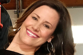
Oh Boy, Oh Boy! I get to photograph inside a real fire house! With real fire fighters.
Dancing fire fighters!
Huh?
The photo was to be a pre-event for an upcoming Fireman's Ball and Fund Raiser. When I got the word, I went into high gear, hoping to do some Joe McNally, big room lighting.
All Keyed Up: I saw Zack Arias use a silver umbrella in a rather novel way: Instead of opening it fully, he'd open it half way so it looked more like a cone than a dome. He would then choke up on the umbrella shaft so that the flash was actually deep inside the cone. This gave a narrow cylinder of light, wider than a grid spot, but narrower than a soft box. This would allow me to aim the light directly at my subjects with minimal spill onto the background. In theory, this would give me full control over my foreground lighting, since there would be no spill to worry about. If I wanted something lit, I'd have to light it.
 Photographers Plan. The Gods Laugh
: For nearly two weeks, e-mails flew back and forth, trying and re-trying to secure a location and some willing subjects. I made the decision to run with a "Princess At The Ball" theme, and had intended to pose two firemen helping a firewoman, dressed to the nines, emerge from a fire engine. I thought the idea of a woman having two possible dance partners would provide some visual interest. I assumed it would be easier to get to off-duty firemen to pose in the shot, since there would be more of them available. I even went so far as to fax this concept sketch to my Fire Department liaison. Plans were made for a 10:00 am shoot so that Cissie could join me.
Days pass. Then the wheels started to fall off.
Pot Hole #1: "We can't find female firefighters. Can we do two men?" I respond, "Wives, sweethearts, almost anybody will do."
Pot Hole #2: "We located the
fiancé of a firefighter. Unfortunately, she's a teacher and would only be available after 4:00." I respond, "I'll move the date and the time to something more convenient."
Pot Hole #3: "We have two women, but only one man." I respond, "We can just reverse the roles illustrated in my sketch. Now we'll have two ladies helping a fireman out of the fire engine."
Pot Hole #4: "I am down to a single female, and we'll need to make the shot at the administration substation where she works. I can have an antique fire engine available for your use." I respond, "That will work. I'll see you there."
I arrived at 4:03 pm, planning to begin photographing at 5:00 sharp, for no more than ten minutes. it turns out that this is where the two antique fire truck are stored. My female subject, a fire inspector, is getting dressed. Two fire engines inside the station, some ambient light, but workable.
With nearly an hour to set up, I start putting my lighting solution together. Key Light is a Adorama Li-on radio control flash, set to Group A. A second Li-on, designated Group B, serves as an Accent Light to illuminate the Station Banner in the background. Two SB-800s are placed to serve as kicklights from behind. I wasn't happy with the direction the photo was taking until I dropped the shutter speed down to 1/30 of a second. The background came alive with a large highlight on the floor behind my dancers provided by the windows (not the flash) in the back wall.
Pot Hole #5: Since this was a regional effort, I was asked to avoid showing any references to a specific city in the photo. Because the fire engine on the left was marked "Burlingame", I had to take a lower shooting angle so that it wouldn't show. Then the shooting schedule was moved up because my subject had to leave at 4:45. I could have used those additional minutes, but deadlines are deadline, so I started shooting.
It quickly became obvious that the banner light was a little too "hot", but when I lowered the output of this Group B light, the image wasn't improved. Still, the brilliant hair light (camera right) manage to brighten up my dancers without causing an excessive amount of lens flair. I had a number of usable shots, but this one had good expression and my dancer's left leg clearly defined.
After I showed my subjects some of the preliminary images, I turned around to see that several of my subjects' office mates were happily recording the event on their iPhones. When I showed them our progress, they too were pleased with the results.
At the last minute, I decided to make a few shots without Group B, knowing that the overhead banner would be darkened and therefore, less recognizable. As it turned out, these photos were lit with only one light because the (camera right) hair light, configured as an optical slave, couldn't detect my key light. The shots did emphasize how much the ambient light was adding to the photo.

One might argue that the shot could have been made using only the ambient light. After all, I could have arranged for the garage doors behind me to be opened. But there is still one point to remember: Without that additional flash, I would lose my ability to create a shadow on my subject, which is necessary to give the face a three-dimensional quality. In this enlargement, you can sense from the shadows under my subject's chin and nose that I'm looking at a real face. This low contrast lighting is more flattering and nearly all faces, so if it makes your subjects look better, why do it? The image isn't as crisp as I would have liked, but it was made at 1/30 of a second, and the subjects were moving.
For me, the take-away from the assignment is to get the ambient lighting right before adding my flashes. I think I was a little too quick to place speedlights where I thought they would help the image. Maybe then I would have had a better idea of what areas of the image need additional light, and which areas I should have left alone.
Update: When the photo was printed, nearly all of the background and foreground was cropped out to make room for two additional photos and their captions. Admittedly, most of the spirit was retained. Perhaps I was showing too much limb.
I would love to return to the station and attempt to right the wrongs made during my first attempt. More likely, I'll keep those lessons in mind for the next time I must make a photo under similar conditions.
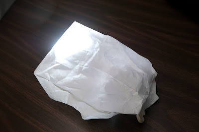
 This shot gives you a subject's eye view of the ISB. The flash is a Lumopro 180, which was one of the first to have a 1/4 x 20 threaded insert to facilitate near-axis mounting when used with an umbrella. Because of the "deep within" positioning of the flash, the surface area of the flash is both large, and contained. The photo clearly shows the borders of the light, and can be adjusted by choking up on, or extending, the umbrella shaft. I used a bounced flash to provide some fill and to trigger the optically triggered Lumopro.
 I made this second shot without the fill light. You can easily see the disk of light created by the umbrella, which is probably equivalent to what
you'd get from a 24" softbox. But unlike the softbox, the light "fades" as it moves towards the edges, so you won't get a clean edge that you can effectively feather. This is a pretty subtle thing. something I haven't experimented with in the field, primarily because one doesn't have much time to make those subtle, but necessary, adjustments to place this "twilight edge" where it could be used to its best advantage.
 One small problem with this setup can be seen in the catchlight. This
highly magnified selfie shows and exact reproduction of the umbrella and
the silhouettes of the flash and the light stand in my left eye. And
while the need for such a detailed closeup is seldom required or
justified, it is there, just in case it matters to you or your
photograph.


