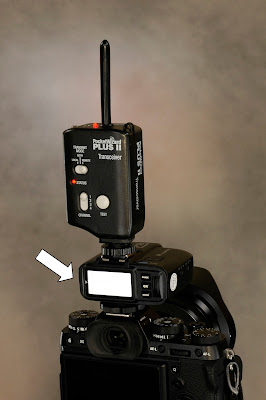
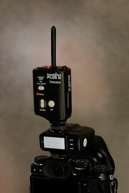
Most recently, the star of my lighting show is the Flashpoint eVOLV 200 flash. The obvious selling points, namely the bare tube options and the 200 watt-second output, totally won me over, and as you can see, the controller is mounted directly on the camera, since this flash is normally the key light. The hot shoe on the top of the controller allows the user (me) to mount a second device, which could be a TTL flash or another radio controller.
For the Linkedin photos described in the last post, I mounted a radio controller, similar to the Pocket Wizard I installed for the photo, to control the background and kicker lights. This way I could control the key light with the lower controller and these two supplementary lights using the upper controller.
Making The Shot: Ever since I started "painting with flash" on my closeup product photos, I've tried to infuse a greater level of control with each new shot. Here, I'm centering up the background light around the uppermost flash controller. Before I started making these test shots, I devised a sequence align my subject, the background splash of light, and the camera I would use to make the actual photo.
- Step #1: Taking Camera and the Controllers: First, I mounted the taking camera, a Nikon D70s with a Macro Nikkor lens, on a tripod and aimed it towards a blank wall. Next, I moved a second tripod carrying the camera and the shoe-mounted controllers until they were nearly centered in the frame. Final framing adjustments were made at the camera position.
- Step #2: Aligning the Background Splash: Using a Nikon SB-800 speedlight with a Impact Strobros Snoot, I made exposures of the blank wall, adjusting the speedlight until the splash was in the center of the frame and behind the controllers.In the first and second shots of the triptych, you can see my first shot was low and to slightly to the right, the second just to the right, and the last shot spot on. You can see that the colored background was added for that last shot.
Lighting The Subject: With everything in place, I turned out the room lights and set the exposure to 20 seconds. After I tripped the shutter, I used multiple pops from a speedlight mounted in a small, 12"x18" softbox to light my subject. I popped the flash a total of eight times, changing my position after each firing.
After this test, I noticed three things I didn't like. First of all, the controllers looked a little static when they were turned off. Next, the lanyard attached to the Pocket Wizard was very distracting. Finally,two large hot spots appeared on the right surface of the controllers.
Removing the lanyard was easy enough, and I solved the glare problem by changing where I stood when I made the background exposures. By directing the light in a perpendicular path with the side of the controller, I was able to eliminate the hot spot.
 This next attempt is very close to what I had in mind. I hadn't anticipated the overexposure of the LCD panel on the lower unit. I scratched my head over this one, but came up with a suitable work-around.
The LCD panel will light up when any of the control buttons are pressed, and will stay on for about 30 seconds. Up until now, I had turned it on, and immediately press the Nikon's shutter release to start to 20 second time exposure.
To decrease the brightness, I pressed one of the flash controller buttons, and counted to fifteen before tripping the shutter. This reduced the amount of "on time" relative to the exposure time, and resulted in the panel being a bit darker, just as I had hoped.
When looking at the final image, you can see that the numbers are barely visible, even with some judicious darkening/burning of the numbers. The LCD panel wasn't that bright to begin with, and the result is about as close as anybody could get considering the lack of contrast.
 Ta-Dah! Here's the final shot. There was some judicious level adjustment and the work done to improve the visibility of the numbers and some cropping to straighten up the image, but other than that, nothing else was done.
Looking back I was a little surprised on how much stray light "landed" on my background, a problem I could have solved by moving the background farther away from the subject camera. I was working in a relatively small workspace, so such an adjustment wasn't practical. Also, the lower flash controller blends in with the subject camera, a problem easily solved by a lower camera angle.
Finally, it's important to know that because I am hand-holding the small softboxes, the lighting will vary slightly from shot to shot. Notice that when I solved the glare problem by changing my lighting position, I inadvertently removed the highlight necessary to separate the lower controller from the Fuji camera it was mounted on. I'll remember that when I have to make a similar shot under similar circumstances.


