Sunday, October 28, 2018

Photo In A Brewery Tasting Room

1/15 second, F 5.6, ISO 1000
The assignment called for a photo of a charity award presentation at The Devil's Canyon Brewing Company in San Carlos. An unusual venue for an award ceremony, to say the least, so it immediately got my attention. I had now idea what to expect, but I wanted a chance to mix artificial (flash) lighting with a variety of ambient sources.

Visual Elements: I wanted the image to have the following visual elements:
  • The Brewing Company's Name to establish a location context,
  • The industrial ambiance to add some visual interest to the background, and
  • Anything else I could find.
Ambient Light Sources: I had several sources of ambient light to address:
  • The skylight visible at the roof line in the  background which created the accent on the floor, camera right,
  • Another skylight on the wall me,
  • The accent lights on the wall behind the bar, and
  • A ceiling light that provided the warm accent at camera right.

1/16 of a second, F 6.4, ISO 800, with 2 Nikon speedlights (see arrows) aimed towards the ceiling
Supplementary Background Lighting: A simple go-to technique is to add some remote accent lights to give some detail to the background. Two Nikon speedlights in SU-4 Mode (optical remote) were placed on the far ends of the  bar. This would give me enough detail in the ceiling to make the features just recognizable.

Key Lighting: The main, or Key light was provided by a Adorama Li-on Flash shot through a white shoot-through umbrella mounted on a Manfrotto Compact Monopod, both of which store neatly inside of a Vangard Veo 37 camera bag. While not particularly sturdy, the monopod extends to almost 5' and can easily support a single speedlight and an umbrella, if held vertically. This allows me to extend the monopod to full length and, if you can rest it on a chair, an assistant can get the flash almost 7' off the ground.


1/8 second, F 5.6, ISO 1000
Hurry Up And Wait: The photo was to have gone down at 6:10 pm but as traffic would have it, major accidents prevented my subjects from arriving until 6:50. With everything on the schedule pushed back, the pressure was on to get this over with.

The waiting had a serious consequence: The natural ambient light provided by the skylights was fading, and I had to lengthen my exposure if I was going to use it in the exposure. I was now wrestling with the background lighting since my flash would take care of the foreground. This was one of my first test shots, so I was free to adjust exposure, so long as it could be done quickly.


1/2 second, F 5.6, ISO 1000
The Money Shot: The final exposure was increased to 1/2 second to help bring out the background highlights. I knew the exposure would be a long one, so I warned my subjects to hold VERY still and not move until I brought the camera away from my eye. You can see that the final included a final late-comer, and he was inserted with little difficulty.


If you compare the exposure data from the image at the top of this post, you can see that I had to increase my exposure by three stops to maintain detail in the background. Holding still for 1/4 of a second should be considered unwise based on the "inverse focal length rule", created to give you the approximate longest recommended exposure for a given focal length of lens.  EXIF data for the image lists the lens focal length at 13.8 mm, which I multiplied by 1.5 to compensate for the crop factor of the Fuji's APS sized sensor. With an effective focal length of 20.25 mm, the rules concludes the the longest, wobble-free exposure should be 1/20.25, or about 1/20 of a second. The enlarge portion of the image clearly shows the effects of my long exposure time, but the beer menu in the background is sufficiently sharp for our purposes.


I am satisfied by the results, even though evidence of my attempts to partially illuminate the ceiling details are not readily apparent. In situations like this, the final composition must be modified on the fly, especially when the size of the group starts to grow, as it did here. I found comfort in knowing that whatever shooting angle I finally took, the speedlights had my background realistically illuminated.

The photo ran a week later, along with a photo for Tip A Cop, and fundraiser held by the San Mateo Police Department to raise money for the Special Olympics.

Sunday, October 21, 2018

Miss Saigon


Photo by Michael Le Poer Trench and Matthew Murphy
In September of 1989, the musical Miss Saigon opened at theTheater Royal in London, and subsequently debuted on Broadway in 1991. In an iconic scene depicting the fall of  Saigon and the evacuation of the U.S. Embassy, a reproduction of a Huey arrives on stage and is seen airlifting the last evacuees from the compound. And to add to the indignity, the choppers, after discharging their passengers on waiting ships at sea, were shown on the news being unceremoniously dumped into the ocean, as if to emphasize the one-way nature of their last flights.

I suppose it was no accident that the stylized calligraphy on the publicity poster faintly resembles a doomed Huey "slick" plunging back to earth after completing its final mission.

Segue To 2018.  A new production of Miss Saigon is traveling across the country and is currently in San Francisco. As such, it rates a mention in the Journal's entertainment section. As it turned out, members of the cast would be visiting EMU Incorporated, a Hayward-based, non-profit organization that maintains a fully restored Bell UH-1 helicopter, the same chopper that figured so prominently in our collective memories of the war. 

First Shot: Cast members were invited to climb aboard EMU 309, and once inside four actors, Joven Calloway, Jonelle Margallo, Brandon Block, and Michael Russell, spontaneously decided that a selfie was required to immortalize the event. As soon as I saw that Mr. Calloway had decorated his smartphone with the iconic Miss Saigon logo, I knew I had my shot.
Technical Note: This photo was made using a flash bounced off the wall behind me. The mixture of natural ambient and artificial light made for a strange color mix, and since I had a white(ish) wall behind me, I decided to use it. The setup wasn't perfect, as there was some fall-off on the subjects who were farthest from the door.

Preflight: After a while, the great bird was rolled out onto the field and prepared for takeoff. The ground crew began its meticulous preflight check, and in a few minutes, the cast members were allowed to board the helicopter. Due to the noise, everybody was issued hearing protection. One additional passenger was  Torque, EMU 309's K9 Mascot. Torque took his place by the door, and would be secured by a harness when in flight. He was obviously eager to join the cast, and quickly made friends with everybody.


Torque is both a unit mascot and a reminder of the valuable service dogs played during the conflict, having served as scouts, trackers, sentries, and mine and booby trap detectors.


Final Shot: Just before the first flight took off, the cast and EMU crew members posed for a group shot. I waited until everybody else had made their own photos, and then proceeded to tighten up the group to make my shot. Again, flash was essential for bringing out the details that would otherwise be lost in shadows. Shots made under similar lighting circumstances without supplementary flash often suffer from highlight overexposure when the photographer attempts to improve shadow detail. A shoe-mounted flash, combined with the small amounts of existing ambient, added just enough detail without looking over-lit or unnatural.

So Where's Torque? For me, the photo was a near miss because of Torque's position in the group photo. A black dog sitting in front of two cast members in dark clothing rendered him almost invisible. Doh!

Next time, I'll invite the two gentlemen in white to move to positions behind Torque so that he could be seen. And I'm sure I could have convinced Mr. Vest to remove it so that Torque could have his moment in the limelight!

X-70 Backup: Ever since I installed a filter and fixed lens hood on my X-70, I feel totally comfortable letting it ride around inside my camera bag uncased. Easily accessible, it's ready to go in the event the sunlight gets totally out of hand and a flash supplemented exposure of 1/500 of a second or faster is required. Granted, I am sure to flinch if the filter is ever scratched (I went with a moderately expensive B&W UV), but the assurances that the front element of the lens being properly protected are worth the cost.


From Page 20 of the October 19, 2018 on-line edition

Sunday, October 14, 2018

Japanese Culture Day 2018


West Meets East: I attended Millbrae's Japanese Culture Day intending to make a photograph that combined as many elements that illustrated the celebration of the eastern and western dynamic. When I noticed that the backdrop featured both American and Japanese flags, it was an easy go-to background to help build on that theme. I watched a number of performances and settled on this dancer performing a traditional Japanese folk dance. From where I crouched, a perfect combination of composition, context, and expression was not possible, but I believed this photo was the best compromise of these three qualities.

Mayor-San: One of the guests was Komei Kawata, mayor of Hanyu, Japan. He was giving a welcoming speech to the many guests when I noticed the twin flags at the podium. Again, I included them in the composition, but because of my position, was unable to "move them closer". Like the shot at the top of the page, I was pretty much stuck in one location, and while it worked for my dancer, it wasn't optimal for the Mayor. 

Incidentally, the hat was a paper origami construction large enough to wear, and had no special significance, according to an aide to the Japanese Consulate, who was in attendance.


Kids: Okay, this was my attempt at shameless pandering to readers whose kids might make it to the front page photo. In this case, I still had the flags, and hoped that the adult coaches (Did you see the man crouching behind his daughter?) would add a bit to the back story.


I submitted this second shot because of the interaction between the singers and the woman at the  right. Her posture and expression were better than the first sample, and while I had enough pixels to crop it tighter, I felt that the more children, the better. I'm sure that there are dozens of grandparents who are thankful that I included so many of the little darlings.


Making Mochi: In this photo, taken through an opening in the tent's mesh walls, we see two volunteers using mallets to pound rice flour until it reaches a doughy consistency. It will be formed by hand into the familiar balls of mochi. In this shot, the mallet is not easily recognized, so it wasn't submitted. Also, there was a lot of empty space, which I try to avoid.

I was restricted from entering the food preparation area, so most of these shots had me reaching through openings in the tent with a Fuji X70 held high overhead. I used an Nikon SB-80 aimed into the ceiling with a paper plate used as a bounce card. In this case, the tent provided a low bouncing surface, so the plate was more of a fill card.


I submitted this photo as an illustration of a step in the process. It has the advantage of illustrating the attention of the two subjects, although what they're actually doing requires a detailed caption.


Editor's Choice: In the end, the Editor In Chief chose this photo to run on Page 1 of the Wednesday edition. I almost gave up on any of the photos making the paper, but there is something to be said about the universal appeal of kids performing on stage for what may be their very first time.


Time To Go: The party was still going strong when I finally left at 2:00 pm. I wanted to get some lunch before heading back to the city to process and submit the day's take. I photographed this young lady partly out of envy, as I often wish that happiness could be found by simply wearing a top with my favorite animal and eating/drinking a bowl of Hawaiian shaved ice. 

Sunday, October 7, 2018

Coffee With A Cop

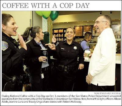
In many ways San Mateo is like a small town. An event like national "Coffee With A Cop" day might not get much play in most big cities, but I can say without reservation that San Mateo takes community involvement seriously. My contacts with the police and the judiciary have all been positive, and all my subjects were extremely cooperative in setting up shots.

The Particulars: I arrived on the scene about 30 minutes after it officially started, and 90 minutes before it was due to end. As always, I tried to image a backstory for my photo that would be reinforced by the actual photograph. The obvious point was a friendly interaction between citizens and some police officers. To this theme, I wanted to add some contrast, and when I saw this friendly exchange between three female offices and a single male civilian, I know I had the makings of a suitable photo. The difference in their apparent ages helped add to the contrast.

Visual Hook: Once I found both my subjects and a suitable composition, I started shooting. This was not a posed or guided shot, but a true candid, and after a few minutes, I had 15 shots to choose from. I made the following mental notations about several shots:
  • Shot #5: A balanced framing, good expressions, but the hands are look a little a little "fisty" and defensive.
  • Shot #10: The pointed finger, placed against the dark color of the uniform, provide a visual hook, but it looks almost accusatory.
  • Shot #14: The subject of the conversation turned to the officer at camera left, and all of the faces express a friendly exchange. Because the attention is shifted to the left, my male subject turned his head slightly toward the camera, giving me a better "face" than if he had been caught in profile. The viewer must concluded that there is friendly story with conflicting points of view, one that my male subject finds engaging, and amusing. 
I didn't submit the image until I returned home in the afternoon. The photo ran the next day, front page and above the crease. I guess my the Editor In Chief liked the photo I selected, and that it reflected to community spirit that the event was designed to encourage.

It is helpful to remember that almost every photograph can be refined to clarify the message intended, and barring any Photoshop shenanigans, the only way to achieve this is to identify the message the photo should convey, find the visual elements to promote that message, and continue to shoot until you capture something that the viewer is likely to understand.

Monday, October 1, 2018

Nick Cahill

Nick Cahill is a native of San Mateo who just submitted the cover photo for a National Geographic special edition on the heavens, which for the Journal instantly makes him a local hero. He had a showing of his photos at a small local gallery, and I was asked to submit an image for publication.

When I arrived at the gallery, I immediately started looking for a suitable background, all the while keeping my eyes and ears pealed for somebody who resembled the Internet photos of Mr. Cahill. I found my background first, a converging pair of walls where some of his photos had been hung. Just to be safe, I checked the ID card by the photo to confirm that these were indeed his. I was hoping for something similar to his NGS cover, or some photos of the nighttime sky, but had to settle, if that's the word, for  his beautiful shoreline photo with a distinctive blue tint. If I could position my subject at the disappearing point created by the converging lines int he background, I could direct the viewer to my subject's face. With both the coloration and the composition clearly in my mind, I was ready to start shooting.

For the sake of simplicity, I decided to stay with a simple Gary  Fong Light Sphere held high and to my left. Instead of triggering the unit with a Nikon SB-29 cable, I decided to use a controller/remote pairing, just in case I needed some fill to help the existing ambient light. With a lighting solution in place, I went about establishing a base line ambient exposure.


Indoor White Balance: When I started, I wrongfully assumed that an incandescent white balance preset would be the ticket. After viewing my first ranging photo, I realized that the lighting in the gallery must have been closer to daylight, as my first test was so blue (left). Changing the setting Cloudy brought everything back into line (right).

This first shot was made without the benefit of my flash, as I was having some synchronization issues. I does point out that the ambient contributed very little to Nick's overall illumination, which meant that my flash would provide nearly all of the light necessary for a proper exposure.

When I finally solved the exposure problem, I made a series of photos that included some with eye contact and some of Nick speaking to somebody just out of view. I made nearly a dozen shots, each time trying to get the exposure under control, all the while keep up a conversation to hide the fact that something wasn't working to my satisfaction. Finally, I got everything under control, and made the photos I was sure I would ultimately submit.

Just Kidding!
Check, Check, And Check Again: After a handshake, a farewell, and a wish of good luck, I started to pack up my equipment. However, I was visited by a Ghost of Photos Past, and was reminded of an auto-focusing error that yielded a series of well composed but out-of-focus group images. Seeing that  my images weren't as sharp as I would have liked, I requested a quick re-shoot, concentrating only on achieving critically sharp focus. This was done in less than a minute, and satisfied with the results, packed up for good. Granted, my soft focus originals would have been acceptable, but my subject was a photographer who had scored his first major cover and, in short, I was a little intimidated by this young man less than half my age.

Looking back, I'm glad I did the re-shoot, since the soft focus, the only technical flaw in the original photo, had been eliminated. I must admit to becoming too complacent in my focus  verification, and while I had my Hoodman Loupe in my bag, I didn't bother to use it. This should be an object lesson, one that requires a refresher from time to time.