Sunday, May 25, 2014

Soul Stroll 2014


I was at the Soul Stroll, a fitness awareness event in San Mateo. The featured guest was Laila Ali, the daughter of boxer Mohammed Ali and a world class boxer in her own right. My take on the assignment was simple enough: Show Ms. Ali interacting with the crowd. How I did it was up to me. 

Since this was an outdoor assignment, I packed my "outdoor" camera kit: 2 Nikon D70 bodies, along with a Tamron 10-24, Tamron 28-75 2.8, and a 70-300 Nikkor.  Since weight is a factor, I don't carry constant aperture lenses except for the 28-75, which is light enough to justify its inclusion in my bag. There is my usual single SB-800 speedlight, but I added a second flash, a LumoPro LP 180 complete with a Chinese knockoff battery pack. I chose it instead of another SB-800 because its rudimentary mounting foot lacks the "flash present" contact, allowing it to sync at all speeds in the D70. The LumoPro LP will also work with Canon cameras, and safely too. By attaching the supplementary battery pack (it holds 8 AA batteries) the combination has a very fast recycle time. It has neither iTTL nor non-TTL aperture exposure automation, but if one can maintain a consistent camera to subject distance, it isn't as much of a problem as you might think.

Photo #1
It was going to be a few minutes before Ms. Ali took the stage, so I "warmed up" by photographing some of the participants dancing to music provided by a local radio DJ. Even though there was plenty of cloudy-bright morning light, I let the LumoPro add some supplementary lighting on my wide angle shots. (If you look closely, you can see a shadow on the grass). The output was kept low so that it wouldn't overpower the exiting ambient light. I chose to shoot from a very low angle in attempt to get an interesting cloud background. Exposure at ISO 200 was 1/1000th of a second at F 5.6, set manually. This would allow me to keep the sky, a major portion of this sort of composition, consistent from shot to shot. I also underexposed the sky slightly to help accentuate the clouds. I would now simply adjust the flash output to brighten the foreground when needed, which in this shot,  was set to 1/4 power. For the most part, all of these settings were made by eye, not by meter. The result (Photo #1) was a cute photo, but not a keeper.

Photo #2
Shifting to a second D70 with a 28-75 2.8 Tamron allowed me to get tighter compositions by just changing cameras (Photo #2). Here, I could concentrate on expressions that might make for an interesting photo. I concentrated on this young woman, since she seemed to be enjoying herself. The light was pretty even, so I set this body to Aperture Priority and let the camera decide on the exposure, which in this case was 1/400 at an aperture setting of F 5.6. I felt comfortable with aperture priority because the sky, if it appeared in the composition, would not unduly influence the exposure and cause the foreground to be underexposed, as it sometimes happens.
Photo #3
When Ms. Ali stepped to the stage, I managed to grab this shot using the 28-75 Tamron set to about 50mm (Photo #3). I thought about including as much of the "Soul Stroll" sign in the background, and waited until she and I could take positions where this could happen. When she did, I made this shot (Photo #4), and while it did have the sign and Ms. Ali, there wasn't enough context to warrant submission.

Photo #4
Two other people came up to the stage, and Ms. Ali offered encouragement as everyone did their warmup routines. My exposure, set in the manual mode, was 1/1000 at 5.6, which allowed me to keep some cloud detail in the background. The on-camera flash, set to 1/2 or 1/4 power, gave me enough light to fully illuminate everyone on stage, and keep some detail in the banner in the background. When used on-camera, the flash is essentially on-axis fill and will create specular highlights that often hide the 3-dimensionality of the subject's face. But when the subjects are as small as they appear here, it may not be important.

Photo #5
Photo #5 was rejected because the man at camera right is facing out of the photo. This draws the viewer's attention out of the photo, so I waited for another shot. When his position was more "neutral", I made another exposure (Photo #6). Luckily, Ms. Ali was very animated, and happily cheering everyone on. This shot had everything I wanted, so I wrote a caption and submitted it.
Photo #6
Everybody started moving to the starting line, where an archway made from balloons had been installed. The official photographer was already arranging a shot, and interestingly, asked that everybody put down their cameras until after he was finished, just as I might have done. When he was finished, I decided I'm make one too, since the crowd was in good spirits and could be cajoled into smiling without a lot of effort. So I gave them the "Let's all cheer on the count of three" routine, and this is what I got (Photo #7).
Photo #7

The result was a fun shot, and I could have easily submitted it. Unfortunately, what it gains in spontaneity if loses in context, since there isn't anything that remotely ties it to the event. I've seen worse shots published in the Community Section of the paper, but no matter how interesting the photo, it still doesn't project the spirit of the event. This shot could have easily been improved somewhat by asking Ms. Ali to take a few steps toward the camera. I decided not to take up any more of their time, so after two quick shots, they were on their way, and so was I.

Sunday, May 18, 2014

Veterinary Vision

Photo #1
One of the high points of my shooting year is the complimentary eye exams given to registered service dogs by Veterinary Vision, which specializes in eye care for animals. Leaving nothing to chance, I thought it best to schedule a shoot when they would be examining several dogs at once, allowing me more opportunities to get a suitable shot. It happened that I fell in with Warrior Canine  Connection, a group that helps place service dogs with veterans who could benefit from an appropriately trained service dog.

Luke was not too excited about the whole process, and backed away from the veterinarian preparing to check his eyes. He began to back up, perhaps too distracted to notice that he had backed into the space between my legs. Luke's handler thought this would make an amusing photo, so I handed her my second camera body equipped with a wide angle lens so she could make the shot. I held on to my other camera and looked down at the dog, just in case the photo was needed in the future. With a camera in my hands I'm a photographer, not somebody who happened to be in an examining room.Photo #1 was the result.

During my visit to Veterinary Vision, a total of four service dogs from Warrior Canine Connection were present. For the most part, photographing dogs from an adult eye-level perspective is a little bland. But when you get down on the floor and photograph them from their vantage point, the view is quite different. You can see more dog from a lower shooting position but you will have to endure more sniffing and doggie kisses, so come prepared with some cleaning wipes and a change of clothes.

Photo #2

Photo #3
All of the dogs were moved into a single examination room. Because there were three golden retrievers (2 can be seen in Photo #2), I needed to find a way to make sure I could properly identify them. When the first dog was examined, I wrote down its name, and shot away. When it was the next dog's turn, I made a quick photo of the ceiling as a separator between dogs (Photo #3). You can see, there wasn't much space to work, but a wide angle lens makes it look almost palatial. Nearly all of the work was done with a Tokina 11-16 2.8 lens, set to 11mm for most of the shots. Because the lighting was so even, I went with aperture priority, ISO 1600, F 2.8, and a shutter speed of whatever, but somewhere around 1/100 of a second.

This is Miss Bea, the second dog to be examined. She was a little nervous, so both her handler and the veterinarian gave her some extra attention to calm her down. When the situation changes this quickly, I usually fire as quickly as I can and I won't stop to chimp (examine) the images as I take them. 


With several photos to choose from, I examined each one, looking for the one shot that had the most visual interest. On first glance, all of the images are essentially the same. But if you look closely, You can see the images 3, 4, and 5 of the composite show the dog in a more relaxed position. The technician's left hand is flat in the second image, suggesting that the dog is being slapped. There were subtle changes in technician's face, which would influence the choice.


Photo #4
I decided to submit the fourth image in the sequence (Photo #4), as it combined good facial expressions, along with a hand that suggested gentle scratching. If you look at the photo long enough, you might convince yourself that Miss Bea is actually smiling!

I guess working with these wonderful dogs is the high point of my shooting year. If only my human interactions could be as simple and straightforward as those I have with these wonderful dogs. 

Color: For the most part, florescent lighting in small rooms can be a real nightmare. Add to that the contrast from top lighting and color contamination from the walls and furniture. Not much you can do about that. Also, the images were converted from Adobe RGB to Screen RGB, and by the time they finally get published (in print and online), the colors look even worse. I'm sure that when I get my final photo assignment, it will be a photo essay on purgatory, made in a room with a blue floor, green walls, and a random selection of old and new florescent lights!

Friday, May 9, 2014

A Solemn Ceremony

I made this photograph of a Color Guard composed of officers from a variety of San Mateo County law enforcement agencies at an outdoor ceremony honoring fallen peace officers. It was held in front of the historic San Mateo County Courthouse in Redwood City. The ceremony consisted of the placing of a wreath at the Courthouse, followed by a reading of the name of each fallen officer and the presentation of a rose in his or her memory.

I was given this "whole cloth" assignment just days before it actually occurred. I had some idea of what to expect (flowers, a color guard, a featured speaker, the stately courthouse), but until I actually arrived, I had no idea how these elements could be composed in a visually interesting photograph. As always, I had enough glass to cover almost any possible juxtaposition of foreground and background elements, but being able to photograph from a good position might not be an option.

Photo #1
I had arrived about 20 minutes before the official start of the ceremony, so I had plenty of time to work with the visual elements. One such experiment involved placing the County Courthouse in the background. At my widest available setting (11mm on on 11-16 Tokina), I could get the entire courthouse only by standing about 4 feet from the wreath (Photo #1). But I was also in the path the color guard would take when presenting the colors, so that idea was nixed. On top of all that, the image wouldn't be particularly strong, no matter how it was populated.

"When you're a hammer, everything looks like a nail". Mr. Speedlight is hard-wired to assume that a supplementary flash is always needed, but when photographing outdoors, light colored sidewalks can provide a natural fill light. So will a light colored building, assuming they reflect enough light in the right direction. It's so liberating to be able to shoot without a speedlight while all of your subjects stand on a natural fill-card, which was the case in all of these images. I was especially grateful for this fact, since everybody was wearing a hat of some sort.

Photo #2
Photographing the Colors was another possible image (Photo #2). During the Color Guard's practice drill, I made a few sketch shots, but rejected the idea when I saw how distracting the background was. In addition, flags are very unpredictable - any gust of wind can send one flapping into somebody's face. Of my sketch shots, this was the only one where everybody's face is showing. In the end, it was not a very strong shot, since its "reason for being" wasn't obvious.
Photo #3
Moral Quandary: When I made this shot (Photo #3), I thought I had my "Pulitzer". The photo had all of the desired visual elements: the rose and a Highway Patrolman who appears to be wiping away a tear. I say "appears", because he was not weeping, just rubbing his eye. I could argue that if I had just happened upon him, I could have assumed that he was crying. But I knew for a fact that he wasn't, and could therefore be accused of portraying something that didn't actually happen. Yes, he was rubbing is eye, but he was not crying, as most readers would assume if they read the caption. But the photo's impact would have been based on inference, not on what actually occurred.

Photo #4
Present Arms: "Present Arms", given as a command, requires all personnel to salute in unison. Although I watched the Color Guard (the team of officers responsible for carrying the flags, or "colors")  practice this movement several times, I was totally in the wrong place when it actually happened (Photo #4). Had I been on my toes, I would have taken a position on the left side of the guard so that their faces would be visible. This photo will obviously wind up in my personal purgatory. When I realized my mistake, I repositioned myself on the other side.


Photo #5
This is the photo I submitted (Photo #5). Intuitively, I liked the image but initially wasn't sure exactly why. I knew from start that the main focus would be on the one officer whose entire face was visible, which was pure luck. Having their heads bowed as in prayer gave me the context. And the small details, such as the white gloves, the black bands on the badges, and the varied shoulder patches pulled the image together. I felt I had successfully sold the mood with enough details for the viewer to infer the nature of the event.

It suffices to say that this shot could only have been made with a large-aperture telephoto lens, which is exactly what I used. The exposure settings were ISO 200, 1/1600 @ F 2.8. The shallow depth of field afforded by the 2.8 aperture and the 190mm focal length helped place the viewer's focus exactly where I wanted it.

Sunday, May 4, 2014

Reflecting on Reflections


The assignment was to photograph an open gallery held in an artist's studio disguised as the backyard of a lovely, Hillsborough home. My assignment was to submit a photo as quickly as possible, since the exhibition would be closing in three weeks. And because community photos only run on Mondays, I didn't have much time between the Saturday shoot date and the Sunday deadline.

My host, Steve Lewis, is a bit of a Renaissance Man, an artist who photographed, painted, and sculpted. Being a photographer, I was a little nervous, as one usually is when working with another practitioner fully capable of making informed criticism of one's work. I had to remind myself, as I remind all of you, that the pursuit of every specialty area, including community photography, will require a specific skill set. It didn't take long to realized that using speedlights was a very foreign thing to many photographers, especially those who tend to photograph landscapes, architecture,and other subjects too large to illuminate artificially. But for better or for worse, working with artificial lights, particularly speed lights, has become second nature to me.

Photo #1
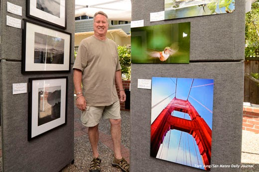
My first impulse was to photograph Steve in front of a display of his photographs, a logical thing to do for a fellow photographer. But when I asked to see his work, I found a display of his framed photographs under a translucent tent in his back yard. Even in this sketch photo (Photo #1) you can see the the entire world reflected in the protective glass.  Short of making the photo at night, I was flummoxed. I gave some thought to returning later in the day when the sky was (hopefully) not quite so bright.

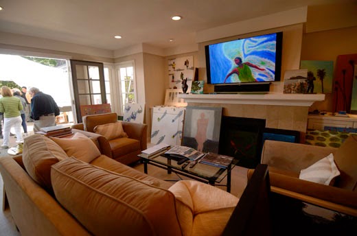
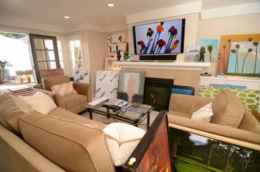
I spoke with Steve about this, and discovered that a small room by the garden held his paintings, some mounted, some on the floor, with others presented in a slide show on the LCD above the fireplace. When I asked if he wanted to be identified as a photographer, he said he thought of himself more as a painter. Light bulb. My focus shifted from the photos in the back yard to the paintings in this anteroom.

Photo #2
Using aperture priority, I made this first image (Photo #2) with an eye on keeping the LCD panel as an dominant graphic element. The exposure was 1/100, F 3.2, ISO 200 with a Tokina 2.8 11-17 lens set to 11mm.
I shifted to Manual exposure and applied the shutter speed and aperture settings selected by the camera. By adding an on-camera flash bounced behind me and to the left, I got this image (Photo #3).

Photo #3
Just for fun, I decided to add an accent light from high, camera left. I used a Rogue Grid on a remote speedlight. I aligned it by sitting in seat and looking at it, adjusting it until the grid was aimed directly at me. This wouldn't provide a lot of light, just enough to give the face some shape. The submitted image is seen here (Photo #4).

Photo #4
I made several exposures, and submitted this one because of the red accents in the painting that was "playing" on the LCD in the background. And just to be safe, I switched to a second camera with a 24-70mm lens for a tighter composition. Both cameras had been set to the same ISO/shutter/aperture settings, so there was no need to do anything but swap out the commander speedlight and shoot (Photo #5).
Photo #5
The tighter composition lost most of the context provided by the paintings in the foreground, and made the shoe far more prominent than it needed to be. After I made a few shots, I decided that this tighter version wouldn't be submitted.

Photo #6
Another photographer, Ken Mahar, had a display of his own (Photo #6). Unlike Steve, his photos were displayed on commercial "walls" which blocked some of the offending skylight. I reset my camera to a more outdoor appropriate setting and bounced a speedlight off the ceiling of the protective tent. The glare, while still present, is not as obvious as Steve's flat display, but visible if you look for it. You can easily see the reflections of other photos in the hummingbird image. I submitted this as an alternate photo, since it says "photographer standing beside his photos", pretty much as you might find him at a street fair on a summer day.

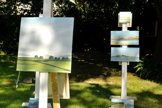
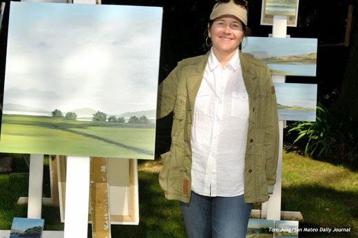
In the case of Susan Olsen, I had chance to practice some new lighting techniques. The problems can be seen in this sketch shot (Photo #7). First, portions of this image are being lit by dappled direct sunlight, so exposure would have to be brief, the ISO value low,  and the aperture small (1/200, F 5.6, ISO 100 equivalent). The goal was to not blow out the highlights in the painting but provide enough artificial fill to bring the shadow areas closer to the highlights.
Photo #7
From the base exposure, I underexposed it by one stop (1/200, F 8.0, ISO 100 equivalent) and used a remote SB-800 at -1 stop of exposure to add the stop back in the highlights while providing an underexposed fill light for the shadows. As an additional trick, I allowed the commander speedlight to add a bit of light (-2 stops, I believe) to fill the shadow under the bill of the baseball cap. By inverting the camera, the light came from below the lens axis, providing some detail on Ms. Olsen's forehead (Photo #8).

Photo #8
Photo #9
You can see that the painting has no blown highlights, and that the shadows from the surrounding trees blend into the texture of the clouds in the painting, an accident that worked in my favor. You can see by this enlarged portion (Photo #9) that there are actually two shadows, something that isn't obvious when viewed from a distance. Shadow Line One is created by the sun, and crosses the bridge of Ms. Olsen's nose. Shadow Line Two appears on her forehead and is created by the remote speedlight. The on-camera Commander creates no shadow of its own, but provides a tiny bit of fill at the upper edge of the forehead. If you examine Ms. Olsen's neck, you will see tell-tale double shadows: The shadow cast camera left from the sun, and one cast camera right by the speedlight. I was reminded of a suggestion made by Joe McNally about dealing with multiple light sources: If I had aligned my remote speedlight perpendicular to the sun, I would have still had double shadows, but they would would be less obvious since they were coming from the same direction. Too soon old and too late smart, I guess.

I was grateful for the chance to do some lighting experiments on this assignment. All of my subjects were very gracious with their time, and particular tolerant of my efforts in setting up the indoor shot. I learned a lot from the outdoor shot, and am anxious to apply what I learned on a future assignment. Perhaps I should remember to bring a polarizing filter to tame some of that glare. Looking back, it might have been just the ticket.