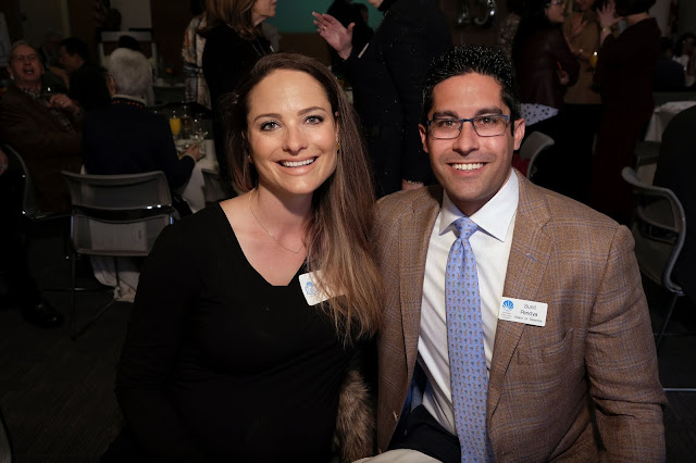
I was asked to make some quick photographs of members of the Leadership Circle at a recent gala celebrating the 25th Anniversary of the San Mateo Public Library Foundation. As with any event where food is served, one needs to get these photos done as quickly as possible to minimize the inconvenience to the guests and the servers. The venue is unusual because the north wall is all glass, allowing natural north-light to flood the tables closet to the wall. This wall of natural light will present a color balance problem when attempting to create as natural looking an image as possible.
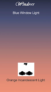
When photographing subjects at the north end (top of illustration), the ambient is mostly from the blue sky passing through the windows. This natural light easily overpowers the ceiling-mounted, incandescent accent lights.
Subjects photographed at the south end of the room (bottom of illustration) are lit only by the ambient incandescent lighting because the window light decreases to the point where they won't influence the overall color of the light. The ambient now matches the gelled flash and the Incandescent white balance preset.
The three images that make up the triptych below are three versions of the same image, taken with the same aperture setting but different exposure times. It's pretty clear that the exposure time used in the leftmost image was the longest, since the background appears brighter than the one at the right.
 |
| 1/64 second, F 4.5, ISO 800 1/125 second, F 4.5, ISO 800 1/250 second, F 4.5, ISO 800 |
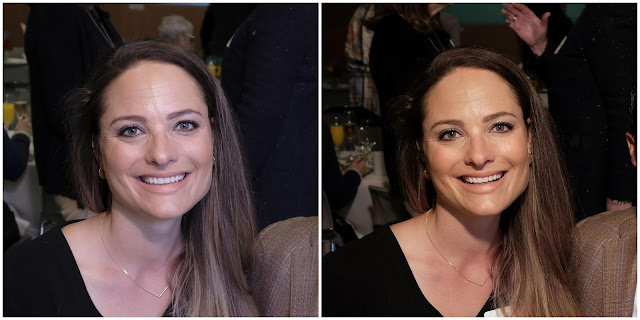 |
| 1/64 second 1/250 second |
 |
| 1/32 second, F 4.5, ISO 800 |
 This shot is typical of the ones made on subjects farther away from the window and less influenced by the ambient north light. The subject's coloration is much truer to what one might expect, and the longer exposure allowed for more detail in the background.
It's interesting to note that there is some evidence of the window light coming from behind me. That tiny spot of blue on my right subject's eyeglasses frame is a window reflection, the blue color emphasized by the camera's Incandescent white balance preset.
The takeaway from this post is that in lighting, one needs to recognize when something is amiss, and to come up with a revised lighting solution to eliminate, or at least minimize, the negative effects. Most photographers will admit that in the end, an acceptable rendition of your subject's fleshtones is all that really matters, and that some mismatches in background rendition can be easily dismissed by the viewer.
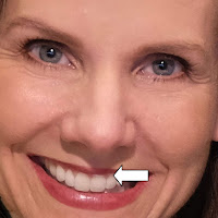
Here's a potential problem that can occur when you use the monopod to position your flash. It is possible to raise it too high, as I almost did here. You can see that the shadow cast by the nose touches my subject's upper lip (see arrow). Had I raised the flash even higher, the shadow would have darkened the teeth, something that should be avoided.
I was fortunate that my subject's facial topography was such that I got suitable catchlights in her eyes, and that the teeth were evenly lit. Very satisfactory for a shot that was done in 15 seconds.
