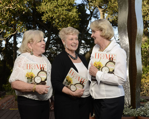
Assignments like this can challenge a photographer in a variety of ways. Shots like this require some level of lighting expertise, but the tough part is balancing the preferences of one's editor and the opinions of the publicist who handles how the event is portrayed to the public. There can be an inherent conflict because my paper's audience may not have the same level of curiosity as the publicist might believe.
It is my goal to provide a shot that is visually interesting, makes a personal connection with the viewer, and accurately represents of the mood of the event. At this particular fundraiser, over 20 design teams each decorated one room of a 9 bedroom, 8 bath, 9,800 square foot home. The Publicist had some specific ideas about how she wanted the event represented, so I decided to follow her lead.
Initially, we had agreed that two shots would be made. The first was an outdoor shot that would include the Event Chairs and highlight a wonderful Archie Held sculpture on the back patio. Lighting was simple. I used 2 Nikon SB-800 speedlights and a Zumbrella on a tall light stand placed camera left. I used my camera bag to hold the stand steady. I settled on an exposure of 1/200 at 5.6, ISO 200. If you look closely, you can see the shadow made by the Zumbrella at the base of the sculpture.
Oops. If you're wondering about the difference in appearance, the image (above) was level adjusted, while the image (below) is straight out of camera.
I brought some extra
SB-800s, so I attached one to a Calumet Wireless Trigger and set it
manually to 1/4 power. I placed it behind a potted plant at the left edge of the image.
This provided a splash of light at the base of the sculpture to better
match the brightness of the upper half. Being radio controlled, it could
be hidden from view, although the tell-tale hot-spot can be barely seen
on the wooden deck. I raised the head slightly, and the hot spot went away.
Quick note: These are "sketch images", so if they appear off kilter, it's because the images weren't cropped or been adjusted in any way.
Now
to add the talent. I gave the three event chairs a magazine to hold.
This gives everybody an excuse to bend their arms, which I believe helps
draw attention to the subject's faces. The shot is still a picket
fence, but it does have the sculpture in the background.
This next shot came after some prompting to "relax" and talk about the show, which animates the subjects. The proportions are different because I cropped it a bit. It's a nice shot, but I felt the viewer might have some difficulty appreciating the sculpture I tried so hard to light.
It only took a moment to step closer and make a shot the emphasizes the individual chairs, as I did for this second photo. By moving close, the sculpture loses it prominence, but I wanted this shot to be about them, not it. I changed out my 11-16mm Tokina with a 24-70 Nikkor, not wanting the deal with the perspective changes a short lens would have produced.
The working conditions for this shot were ideal. Lots of space to work in, lots of time to work with. Things would change when I moved indoors for the second planned shot.


No comments:
Post a Comment