Veteran's Day 2014
Dodged a bullet on this photograph. The Editor In Chief wanted an image that "said" Veterans Day, one with flags on grave markers, to run on Page 1 of the November 11 issue of the Journal. I found this photo (Photo #1) among the photos I made during Memorial Day six months earlier, and submitted it. It succeeded in getting the message across. Thinking back, there is an historical difference between the two events. Veteran's Day was originally called Armistice Day, and is always celebrated on the 11th day of the 11th month of the year which coincides with the cease-fire that ended World War I. On the other hand, Memorial Day, formerly called Decoration Day, was created after the Civil War to commemorate the dead of both sides.
 |
| Photo #2 |
I like these two events because I get a chance to use my longest lens, a Sigma 170-500 mm lens. Thankfully, it has image stabilization, and while the lens is heavy, noisy, and slow, it produces reasonably sharp images, certainly good enough for anything I do for the paper. It allows me to "stalk" a photogenic subject, zoom in nice and tight, and wait for something interesting to happen. This veteran was speaking with somebody at the left edge of the photo (Photo #2). He never backed away so I never got a really clean shot. I left them in so that the Editor could crop the image in any way they wished. Incidentally, I was not asked to photograph this event, so there's always the chance the photo won't be printed.
 |
| Photo #3 |
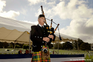
Assignments like this one force you to think about lighting problems encountered in the field. In Photo #3, a quick re-adjustment to the camera (ISO 200, Shutter Priority mode set to 1/250th of a second, exposure compensation set to -0.7 stops yielding an aperture of F18, on camera flash compensation -1.7 stops. Shots like this are a reminder that when shooting with a flash, one mustn't forget the contribution of ambient light to the shadow side exposure. I've noticed than when I underexposed the ambient (necessary to get some details in the clouds) and the flash output, I started to get better results. "Fill flash" is great for the shadows, but can potentially burn out the highlights. In this shot, the on-camera flash isn't particularly creative, but it got the job done.
 |
| Photo #4 |
I was pleasantly surprised by this photo (Photo #4).
Open shade often produces "racoon eyes" because the sky directly
above the subject casts a shadow in the sockets. However,
this speaker was standing under an awning, so she is protected from the
light coming directly from above. This gives some direction to the light that does hit her face. You can see a very distinct shadow below the chin. I had been told that photographing under overhead awnings would produce some very attractive lighting, but this is the first time I'm made a photo where I actually utilized it. Exposure information: 1/100, Aperture set to F 5.6, Aperture Priority, -0.3 Exposure
Compensation, and a white balance preset of Overcast.

This final shot (Photo #5) wasn't submitted, simply because I couldn't be absolutely sure that it was a tear being wiped. Also, there is no flag in the background, which I felt was a very important visual element. His friend, seated at his right, was also a bit distracting, another reason for scrubbing the image. One exposure note: These veterans are facing directly into morning sun. There was some high clouds which helped to fill the shadows. There was just enough haze to allow the audience to look into the sun without squinting.
My submitted photo did not run in the 11/12 edition, and may not run on Monday in the Community Section. Still, the assignment was a lot of fun, and I added something to my lighting bag of tricks. I thought that the natural light shot under the awning was a real eye-opener for me, and a reminder that natural light should be my first choice. I guess I've gotten too accustomed to working indoors, so it did me some good to get outside from time to time.


No comments:
Post a Comment