Dragging Shutter Pitfalls and Other Missteps
 |
| Photo #1 |
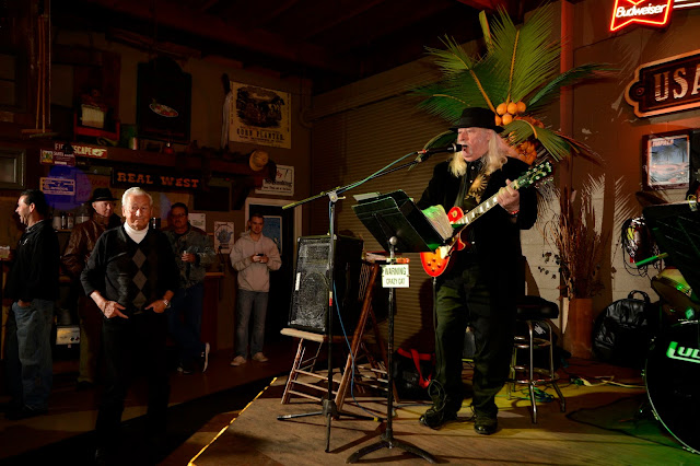
I was invited to a New Year's party thrown by my favorite restaurant in Burlingame. Originally located in San Francisco, it moved to its current location, a two-story building with a commercial space at the ground level and a flat immediately above, located in a mixed use (commercial/residential) part of town. After a time, the neighboring building, an industrial-sized garage with an adjoining office, came onto the market and was subsequently purchased. While the two buildings are not actually connected, a wooden facade gives one that illusion. The outbuilding serves as a staging area for the restaurant, but can be rented for parties since it has a dance floor, a full bar, and an elevated stage (Photo #1), along with an adjoining lounge complete with a wide screen television for "game day" events.
 |
| Photo #2 |
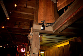
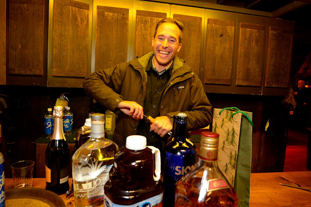
I visited the venue just before the party, mainly to scout out possible lighting solutions. I found that I could mount a speedlight in a Justin Clamp from one of the decorative window shutters placed high on the walls (Photo #2). Once in place, I had a speedlight with a line of sight to the stage.
I decided to go with a Nikon CLS lighting solution to the problem for several reasons:
- The room was small enough for (reasonably) reliable communication between the commander and the remote speedlight clamped to the door,
- I could program it to shoot in the manual mode to insure consistent lighting on the stage, and
- The speedlight could be disabled at the controller, if I wished.
With my key light so mounted, I could use the on-camera controller as a fill light, or "douse it" in favor of using another speedlight mounted on a monopod as a key light.
 |
| Photo #3 |
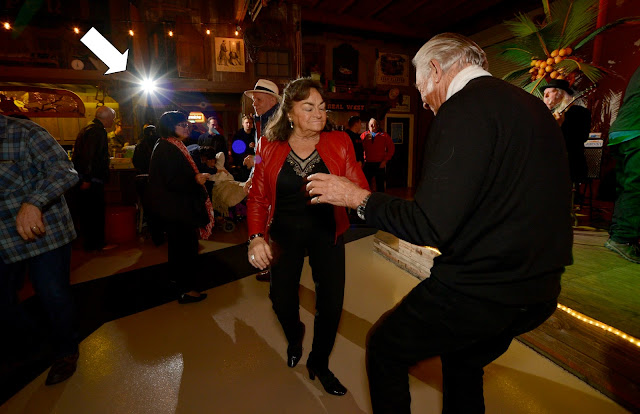
In Photo #3, you can see both the remote speedlight and the effect it has on my subjects. See white arrow. In this shot, it serves as an accent light. This shot also has a ghost, but a smaller one.
 |
| Photo #4 |
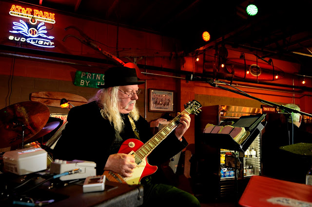
This test shot, made while the musicians were warming up, shows the strong effect of the high-mounted key light, while the on-camera flash provides some fill (Photo #4). To insure a noticeable contribution by the existing lights, I went with a high ISO setting (1600) and an exposure combination of 1/30 of a second and an aperture of F 5.6.
 |
| Photo #5 |
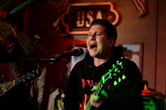
When the Commander Fill was disabled, you can see how dark the shadows were rendered (Photo #5). The neck of the guitar was rendered green due to a gelled spotlight aimed directly at the stage. It was obviously strong enough to register on this ISO 1600 image.
 |
| Photo #6 |
I was using a Nikon D600 with a 15-30 3.5 - 4.5 Sigma wide angle. The lens choice may have been a minor mistake, as this particular lens is prone to flaring, so I occasionally got some mauve "spots" haunting my images.
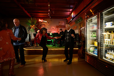
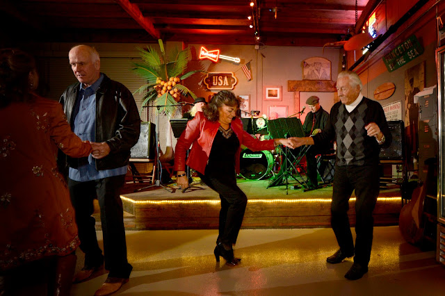
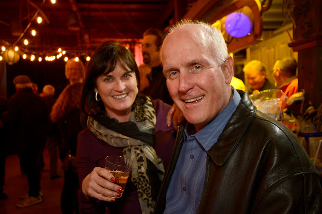
In maneuvering to get this image (Photo #6), I was forced to include the refrigerators at camera right. It was easy to crop the image (Photo #7, below) and adjust the exposure to get a reasonable pleasing image. I could have just as easily zoomed in slightly, but I was more intent on getting some good faces for the image.
 |
| Photo #7 |
 |
| Photo #8 |
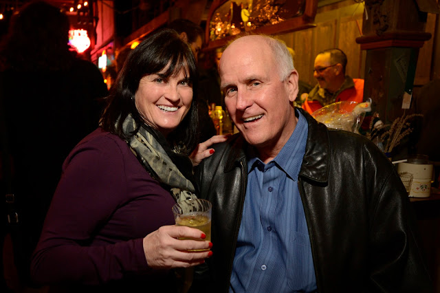
Misstep 1: Depth of Field: Creating images under these circumstances brings its own set of pitfalls, two of which can be seen here.The first is Depth of Field. When working with relatively open (large) apertures, there is a narrower zone of focus, one that is easy for your subjects to wander out of. Here, Denise has positioned herself outside of the zone of focus provided by the F 4.5 shooting aperture (Photo #8). Too bad, it was a nice picture until I examined it under magnification and found it lacking. That purple-ish spot hovering beside my subject? Lens flare for the clamped speedlight.
 |
| Photo #9 |
As soon as I saw the focusing problem, I re-shot it (Photo #9). Not as nice as the first photograph, but sharper. Had I been more diligent and checked the image with the Hoodman Loupe hanging around my neck, I might have been able to immediately re-create the first shot with a bit more depth of field.
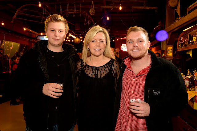
Misstep 2: Color Contamination: In Photo #4, the camera's exposure settings allowed the existing, or ambient light, to add to the open feeling of the venue. This includes the neon signs and the tiny accent lights in the background. I was fortunate that very little light was on my foreground subject, so he is illuminated almost entirely by my key (flash) light, with a little help from some on-camera fill light from the commander speedlight.
In Photo #10 Below, you can see a definite yellow tint on John's face. This came from the lights mounted in the ceiling directly above him. They were obviously powerful enough to contribute to the overall exposure, and there isn't much that could be done short of swapping out my shoe-mounted commander speedlight for one with a CTO gel in place. While such adjustments can be made "on the fly", they can add a new level of complication to the shot, and all such changes must be reset if I was to continue shooting the the manner I had used thus far.
 |
| Photo #10 |
 |
| Photo #11 |
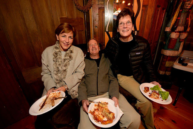
Misstep 3: Lens Flare: It interesting that this shot (Photo #11), and both Photo #8 and Photo #3, were made in the same spot, with the subjects in same position relative to the camera. The culprit is my "Flash on High", which provided the nice accent lighting on their backs. When light comes towards certain lenses, it can shine on the inner surfaces of the lens itself, creating there spots of light. In the old days, one would normally get a line of three or four such glare spots, but modern lens coatings have significantly reduce their occurrence. Had I thought ahead, I could have disabled the light using the camera mounted speedlight controller, but when grabbing shots like this (and I grabbed a bunch!), you won't have time to make complex adjustments. As I mentioned, this Sigma lens was prone to pick up these ghostly aparitions, so I wasn't totally surprised, just disappointed.
 |
| Photo #12 |
Misstep 4: Foreshortening: Wide angle lenses make it a lot easier to work in tight quarters. But the slightest differences in camera-to-subject distances can make for some strange images. It wasn't so bad in Photo #7, but in this sample (Photo #12), it's actually creepy. I look at this image and have to laugh, until I remind myself who the perpetrator of this photographic travesty was. Watch your subject alignment!!!!
In future assignments, I could see myself carrying two speedlights: one with a Gary Fong Lightsphere (right) for shots like this one, and another just for use as a controller for my remote speedlights. This is not exactly an original idea, since I read where Joe McNally had programmed two SU-800s to control two separate speedlight setups running on two different channels. But at the time, the seemingly endless supply of sirloin steaks and buffalo wings, provided by our most gracious host, drew my thoughts elsewhere.
Come to think of it, I might carry a Lightsphered SB-800 and some sort of radio remote controller (Pocket Wizard, say), and switch them out as needed.


No comments:
Post a Comment