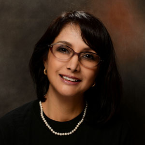
I was asked to make some photographs during our first school-wide retreat. This would have been a rare opportunity to make some reasonably good images of the administration, staff, and instructors at a single setting. It didn't quite work out that way, because it was never fully explained to the staff that photos would be made, nor was it made clear what they would be used for. In reality, they were to be headshots for our web page. As a result, many were casual in their appearance, with some men even forgetting to shave (24 megapixels and a decent lens have a way of show the tiniest missteps in grooming).
By the end of the day, I missed fewer than a dozen. Actually, it's a miracle that I got as many as I did, since I was told on Friday that everything was under control and I wasn't needed to make these headshots. This changed on the morning of the retreat, when I was asked to get a photo of everybody in attendance, essentially taking over the job that was not mine to begin with.
I set up a "photo station" consisting of a background, a speedlight for a "kicker" (backlight) and one for a key (main) light using the equipment I happened to have in my car for just such a request. The actual shooting was accomplished by pulling people out of the lunch line, making the photo in about a minute, and returning them to their proper place in the queue. Needless to say, two additional shoots were scheduled to capture those who had escaped the request to be "shot". With the project essentially done (I'm only missing two or three part-timers), I can catch my breath and make a plan for future shoots. Here's the take-away:
 |
| Photo #1 |
Cropping: On my first shoot, I tended to crop my subject's faces tightly by zooming in. But when working with such a tight schedule, a looser crop would have given me some leeway for cropping in post. Incidentally, all of the shots were made in landscape mode, and cropped square for a purpose: As presented, they are ideal for thumbnails. Cropped to an 8 x 10 aspect ratio, they can be used as an "official", but informal, portrait.
 |
| Photo #2 |
Necklines: Luckily for me, this high neckline forms a natural border to draw the viewer's attention to my subject's face. If asked, I suggest that my sitters wear relative high necklines and jewelry that doesn't dangle too far down. I think that everything came together for this photo.
Portrait Pro: I hardly used this program until now. Basically, the software analyzes the facial features it locates on the image (nose shape, hairline, eyes, exact location of the irises, cheek and jaw contours, and location of the eyebrows), and proceeds to strengthen the jaw line, narrow the chin, brighten the eyes and teeth, intensify the iris color, and remove all hints of texture from the face. Pores, wrinkles, and lower eyelid puffiness are reduced, or completely removed, if you desire. There's the option to dial back the corrections, which I frequently did.
 |
| Photo #3 |
Tall Subject, Short Photographer: I had a problem during the first session. I stand 5'6" and was photographing a subject who was 6' plus. Because of the short working distance, I was essentially photographing "up his nostrils". To fix this, I put the camera in Live Preview Mode, and simply held the camera above my head and level with my subject's face. I got the proper perspective without resorting to a stool or chair. Be sure to chimp each shot to be sure that you achieved proper focus. Incidentally, the feature is much improved since my first encounter on the Nikon D300.
If I had it to do over, I would have had my subject (Photo #3) lean forward, towards me, and raise his chin slightly so the plane of the face was again parallel with the sensor plane. This would have reduced the bulk you can see under his chin.
 |
| Photo #4 |
Interestingly enough, the light was still in a position to provide some very bright catchlights. I was thankful for that, but am bothered by how deep my subject's eyes appear to be. I must admit that she happened to be a"blinker", so I started to concentrate on just getting a shot with her eyes open, forgetting to look at the overall appearance of the shadows. Under different circumstances this photo might pass for "art", but not here. I did have somebody hold the reflector under her face, but for some reason it didn't achieve the desired effect, probably due to the greater distance from the light source. Portrait Pro took care of eye puffiness, but couldn't do anything for the lids.
 |
| Photo #5 |
Posing: For this shot, I asked my subjects to lean forward slightly. I provided a table in front of them to steady themselves with. By having my subjects tilt their heads up, I was able to improve the appearance of the neck and chin.
Bifocal Lines: I was careful to position the head so that the bifocal lines didn't cross the subject's eyes. I'm still amazed at the level of detail I'm getting from the D600 and the 24-70 2.0 Nikkor. This wouldn't have concerned me during the film years. Amazing.
 |
| Photo #6 |
I learned a lot about the mass-production aspect of making headshots. And while I'm not looking forward to doing this again, I certainly feel better prepared.

No comments:
Post a Comment